Ready-made components
same primitives (box, row, text, abs) any app uses — none of it is
mandatory, and any of it can be rebuilt in app code when it doesn’t fit.
Snippets below are lifted from examples/.
Button
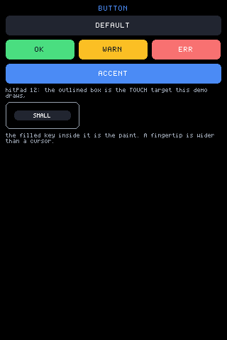
Section titled “Button”A rounded box with a centred label. Everything is a prop with a sane
default: bg (theme key colour), pad (em(1.25)), size (2 — pass
size yourself, the label defaults large), plus w/h, color,
hitPad, and the full tap family: onTap, onLongPress, onHold with
holdEvery for auto-repeat.
From examples/counter/app.jsx:
<Button label="+1" size={2} onTap={function () { UI.set({ count: count + 1 }); }} />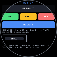
Swatch
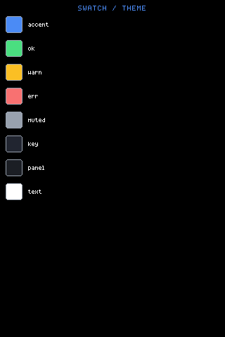
Section titled “Swatch”A colour chip: a bordered, rounded square filled with color. That is the
whole component —
<Swatch color={0x4b8bf5} size={22} />— which is the point of it being here rather than in your app: it is four
lines in mjsx.js, and it exists so a palette is written as a palette
rather than as a row of hand-rolled boxes.
color: the fill. Required; there is no default.size: side length in pixels, default 24. Width and height are the same, so a swatch is always square.
The border is UI.theme.muted, which is what keeps a dark swatch visible
on a dark panel. examples/canvas and examples/draw build their palettes
out of these, and put them on the rim through ArcFooter on round glass.
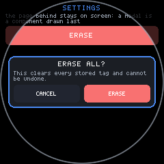
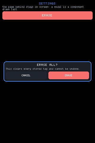
A centred overlay panel, opened with UI.openModal:
UI.openModal(function () { return h(Modal, { header: <text text="SETTINGS" size={2} align="center" /> }, <text text="…" wrap={true} />, <Button label="CLOSE" onTap={function () { UI.closeModal(); }} />);});The margins are minimums, not a size. While the content fits, the panel
is only as tall as it needs to be and centres vertically in what is left.
When the content would not fit inside those margins, the panel pins to the
available height and its content scrolls instead — and header and
footer, if given, stay put above and below that scroll. So the same modal
is a small centred card on a 3.5” panel and a full-height scrolling sheet
on a 1.28” round one, with nothing to configure per shape.
margin: minimum gap to the screen edge, defaultem(1.5).header/footer: nodes that stay sticky when the content scrolls. Omit them and the whole panel scrolls as one.gap: between children, defaultem(0.75).scroll: the scroll zone’s id, default'_modal'— name it if two modals must keep separate scroll positions.bg,border,borderW,radius,pad: the panel’s own box, defaulting to the theme’s panel colour, the accent as a 2px border, radius 10 andem(1)of padding.
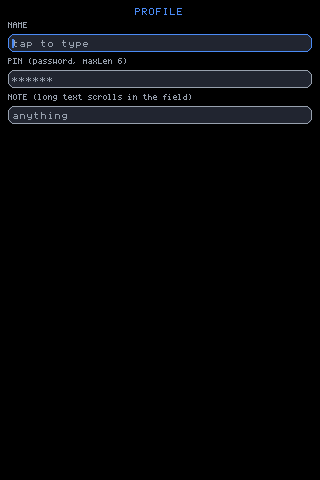
A single-line text field. The engine owns the editing state per id —
text (when uncontrolled), caret, horizontal scroll — so the app’s render
stays a pure description; passing value makes it controlled. Tap
focuses and places the caret, a drag scrolls overflowing text, and
press-and-hold then drag walks the caret under the finger. The caret
blinks; password masks with *; placeholder shows muted when empty;
maxLen caps length; Enter fires onSubmit(text) and blurs, Escape
blurs, and edits fire onChange.
Keys reach the focused field from any keyboard — physical, the built-in
Keyboard layouts, a host’s native one, or an app’s own JSX — because
they all travel as UI.key('press', name) (or UI.type("...") for
literal text). Tab and the vertical arrows walk the focus order, and a
field below the fold is scrolled into view when reached.
exclusive asks the virtual keyboard to take the whole display while
this field has focus (see Keyboard below). focusable={false} keeps a
field out of the focus order.
From examples/input/app.jsx:
<input id={p.id} size={p.size || 2} placeholder={p.placeholder} password={p.password} maxLen={p.maxLen} label={p.label} exclusive={p.exclusive} onSubmit={function (v) { UI.set({ last: p.label + ': ' + v }); }} />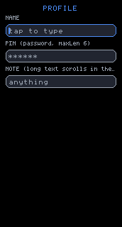
Keyboard
Section titled “Keyboard”A virtual keyboard, drawn as plain JSX over ordinary boxes. Which is also
the whole story for a custom keyboard: build any view whose taps call
UI.key('press', name) or UI.type("...") and it is a keyboard, with
nothing to register — examples/input/app.jsx’s PinPad does exactly
that.
h(Keyboard, { layout: kb, position: pos, height: Math.floor(gfx.height() / 2.6) })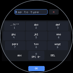
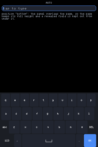
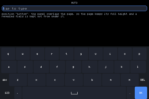
Props and behaviour, all from the source:
layout:'auto'(default),'qwerty','t9','numbers','strip'.'auto'fits the layout to the glass: QWERTY where ten columns of ~22px fit (≥220px), T9 where four of ~28px do (≥115px), STRIP’s single scrolling row below that. A named layout is honoured exactly, however cramped — a stated preference is a decision, not a suggestion. The width that decides is the width the keys actually get: on round glass that is the chord down where the bottom rows sit, not the bounding box (a 240px circle measures 240 across the middle and only 154 down there).- Round glass: each key row is inset to the chord at its own height, so a keyboard is a trapezoid and the outermost keys stay on the glass instead of under the bezel. In exclusive mode the mirrored input is pushed a tenth of the display down, off the narrow top arc, the keys stop short of the bottom arc, and OK moves into that arc — space the grid could never use, so it costs the keyboard no height.
- The space bar carries the
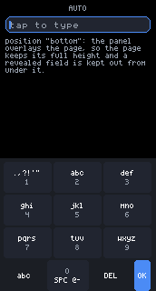
␣mark (a rule with turned-up ends, drawn from lines rather than spelled) and is given its width from whatever the bottom row has left. Where a row cannot hold everything, the punctuation keys drop out — labels are never abbreviated. heightis a hint for the whole keyboard: keys scale to fit it given the layout’s row count (strip has 2 rows, everything else 4 — T9 and the number pad put OK on their utility row rather than spending a whole row of height on it).keyHsets one key’s height directly instead.position:'inline'(default — flows like any child),'bottom'or'top'(an overlay pinned to that screen edge, taking no flow space; it registers an inset so scroll-into-view keeps a revealed field out from under it). The panel is ashield: a press between keys dies there instead of falling through to what the overlay covers, and a docked panel runs flush to its screen edge so the outer row owns edge presses.- Auto-exclusive: if the docked keys would come out under 30px,
docking is a fiction — the keyboard takes the whole display instead,
exactly as an input’s
exclusiveprop would, with a mirror of the focused input above the keys (input state is keyed byid, so the mirror is the field — same text, same caret) and anxkey that sends Escape. A short landscape display (172px glass) hits this on every layout. - Shift is shift-once, phone style: one uppercase character, then it clears. On T9 it survives multi-tap cycling and clears when the cycle commits.
- QWERTY symbol pages:
123flips to numbers and symbols,#+=to a second page, so every glyph the face carries is typeable — brackets, backslash, pipe, tilde, backtick. - T9 is letters-first: each key face shows its letters large with the
digit as a small hint below. Tapping the same key again within the
window cycles its characters (a Backspace then the next character,
through the normal editing path, so it works on any focused input).
Hold a key for its digit, phone style. A long press of
abcopens a symbol pad whose keys multi-tap through themed sets; the space key cycles space →@→-→0. - Strip is a single scrolling row of characters for displays with no
room for a grid: drag to scroll, tap to type, long-press
abcfor the symbol strip.
ArcFooter
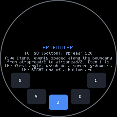
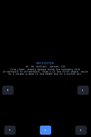
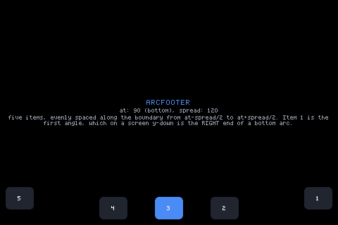
Section titled “ArcFooter”Controls along the edge of the glass, whatever its shape. Each item sits where the ray from screen-centre at its angle meets the boundary, pulled inward by the item’s own size — on round glass the boundary is the rim, on square glass the rectangle’s perimeter, so a bottom arc becomes the bottom edge, a wide one spills around the corners onto the sides, and the same call serves every shape. Items stay upright — only their positions follow the edge.
items:[{ w, h, node }]— finished elements;w/hcentre each one on its boundary point without measuring.at: centre angle in degrees; 90 = bottom (the default), 270 = top, 0 = right, 180 = left.spread: total sweep in degrees (default 120).inset: margin from the boundary (default 10 round, 8 square).
Put wide items mid-list where a round boundary is generous; angles that cluster at a square’s corner can overlap, so keep spread and count sane.
From examples/canvas/app.jsx and examples/draw/app.jsx, which move
their toolbars onto the rim when UI.isRound():
var items = [];items.push({ w: 34, h: 22, node: <Button label="CLR" size={1} pad={em(0.25)} h={22} w={34} color={0xdd6644} onTap={function () { UI.set({ strokes: [] }); }} /> });// ... colour swatches, each { w: 22, h: 22, node: <box .../> } ...{h(ArcFooter, { items: items, spread: 150, inset: 10 })}