Layout
packages/core/src/mjsx.js and behaves the same on every backend. Samples
are in the MicroQuickJS-safe ES5 subset because app code has to be too: no
classes, no arrows, no template literals, no destructuring, no spread.
Screenshots on this page were rendered headlessly by
scripts/shoot.mjs; where a shot came from a snippet rather than an
example, the snippet is quoted beside it.
- Width in, height out
- box: padding, gap, and the vertical stack
- row: side by side
- What flexes and what does not
- abs is page-absolute, not parent-relative
- clip, offX and contentW
- Scroll zones
- The round end margin
- z-order and overlays
- Zero-height nodes: line and path
- Quick reference
Width in, height out
Section titled “Width in, height out”There is one rule underneath all of this. A node is told its width and reports its height. Nothing ever reports a width.
/* How tall will this node be at this width? (Layout is width-in, height-out.)   forcedH pins a node's height from outside — how flex children get theirs. */function measure(node, availW, forcedH) { ... }
/* Draw the node at (x, y) within availW. Returns the height consumed. */function draw(node, x, y, availW, forcedH) { ... }
draw returns exactly what measure returned, and it registers touch
targets as it paints them — the drawn box and the hit box are the same
rectangle by construction.
A frame walks the same node several times: draw asks for its height, a
row asks again to size its columns, a scroll box asks a third time to
decide what is visible. So both the component expansion (node._x) and
the measurement (node._mw / node._mf / node._mh) are memoised on the
node. h() rebuilds every node each render, so those caches cannot go
stale.
The root gets the screen:
draw(h(this.root, {}), sfL, sfT, sfW, sfF);Full-bleed by default. With UI.safe.inset set, sfL/sfT are the safe
offsets and sfW the safe width; and when there is a top or bottom band,
sfF pins the root to the safe height as well, so an app’s usual
h: gfx.height() cannot push its bottom row into a dead band.
Because height comes from content, a page that should fill the screen has
to say so — h={gfx.height()} — and a page that should just be as tall as
its content says nothing.
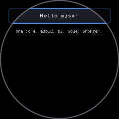
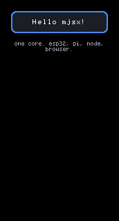
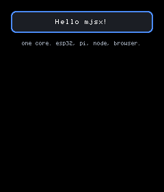
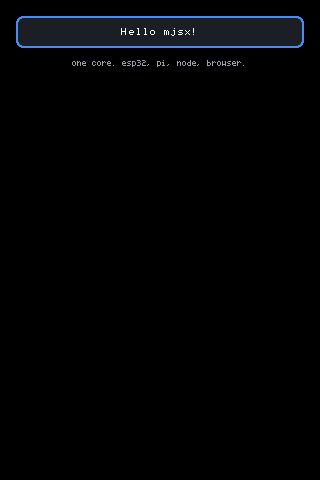
<box pad={em(2)} gap={em(1.5)}> <box bg={UI.theme.panel} radius={8} border={UI.theme.accent} borderW={2} pad={em(1.5)}> <text text="Hello mjsx!" size={2} color={UI.theme.text} align="center" /> </box> <text text="one core. esp32, pi, node, browser." size={1} color={UI.theme.muted} align="center" wrap={true} /></box>box: padding, gap, and the vertical stack
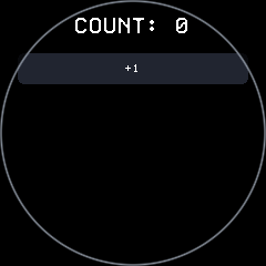
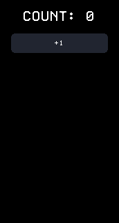
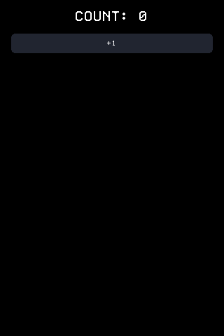
Section titled “box: padding, gap, and the vertical stack”box is the block container: children stack top to bottom, separated by
gap (default 4). Any unknown element type renders as a box.
<box pad={em(2)} gap={em(2)}> <text text={'COUNT: ' + count} size={3} color={UI.theme.text} align="center" /> <Button label="+1" size={2} onTap={function () { UI.set({ count: count + 1 }); }} /></box>The pad family. Each side falls back to the uniform pad:
function padL(p) { return p.padL === undefined ? (p.pad || 0) : p.padL; }function padR(p) { return p.padR === undefined ? (p.pad || 0) : p.padR; }function padT(p) { return p.padT === undefined ? (p.pad || 0) : p.padT; }function padB(p) { return p.padB === undefined ? (p.pad || 0) : p.padB; }The test is === undefined, so padL={0} really is zero and does not fall
back. Children are laid out at availW - padL - padR and drawn from
x + padL. One edge of a screen can be less reachable than another, which
is why the sides are separable at all — the docked Keyboard uses
padB: 0 for position="bottom" and padT: 0 for position="top".
gap is p.gap === undefined ? 4 : p.gap on both box and row, so
gap={0} works. A child with zero measured height consumes no gap:
var kh = measure(node.kids[k], availW - padL(p) - padR(p));/* Marks — lines, overlays — have no height, and something with no height must not push its siblings down by a gap. */if (kh === 0) continue;if (seen) total += gap;w only narrows. if (p.w && p.w < availW) availW = p.w; — a w
wider than the space available is ignored, and a narrowed box is not
re-positioned, it stays at the left edge of the space it was given. To
centre a fixed-width box, put it in a row between two flexible siblings.
h is a promise the box keeps whatever the content does. measure
returns forcedH if it has one, else p.h, without consulting the
children at all. Content taller than h simply overflows, unless the box
also sets clip or scroll.
bg, radius, border and borderW (default 1) paint the box itself.
Border plus fill is drawn as two nested rounded fills — the outer in the
border colour, the inner inset by the border width — because stacked 1px
outlines tile badly on the arcs. Border alone is stacked 1px outlines.
vcenter centres the content in a box whose height came from outside, and
applies only when nothing in it flexes (see below).
row: side by side
Section titled “row: side by side”row puts its children in columns. Widths are split by one rule and one
rule only:
/* Split a row's width among its children: fixed `w` first, the rest evenly. */function rowWidths(node, availW) { var p = node.props; var pad = p.pad || 0; var gap = p.gap === undefined ? 4 : p.gap; var inner = availW - pad * 2 - gap * (node.kids.length - 1); var flexN = 0, used = 0, i, k; for (i = 0; i < node.kids.length; i++) { k = expand(node.kids[i]); if (k && k.props && k.props.w) used += k.props.w; else flexN++; } var share = flexN > 0 ? Math.floor((inner - used) / flexN) : 0; ...}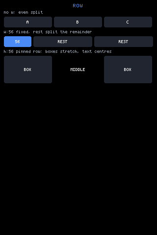
Look at the third row against the first two: it has h: 56, so the two
BOX children stretched to fill it while the bare MIDDLE text centred
instead of stretching.
// scripts/shoot.mjs, FLEX_ROW_PAGE — the snippet that produced the shoth('row', { gap: 4 }, [ cell('A', { bg: UI.theme.key, pad: 8, radius: 4 }), cell('B', { bg: UI.theme.key, pad: 8, radius: 4 }), cell('C', { bg: UI.theme.key, pad: 8, radius: 4 })]),h('row', { gap: 4 }, [ cell('56', { w: 56, bg: UI.theme.accent, pad: 8, radius: 4 }), cell('REST', { bg: UI.theme.key, pad: 8, radius: 4 }), cell('REST', { bg: UI.theme.key, pad: 8, radius: 4 })]),h('row', { gap: 4, h: 56 }, [ cell('BOX', { bg: UI.theme.key, pad: 8, radius: 4, vcenter: true }), h('text', { text: 'MIDDLE', size: 1, align: 'center', middle: true }), cell('BOX', { bg: UI.theme.key, pad: 8, radius: 4, vcenter: true })])Things worth knowing about rows, all of them visible in rowWidths above:
-
flexdoes nothing in a row. Horizontal sharing readswand nothing else. Children without awsplit the remainder evenly, never by weight. Weighted horizontal splits are done by giving each child a computedw. -
w={0}is falsy, so a child withw: 0counts as flexible and gets a full share. -
Nothing clamps: if the fixed widths exceed the row,
sharegoes negative and children are drawn at negative widths. -
A row’s padding is uniform only. All three places that read it —
measureRaw,rowWidths, and the row’s draw branch — usep.pad || 0.padL/padR/padT/padBare ignored on arow. Wrap the row in aboxwhen one side needs different padding. -
Height without
his the tallest child pluspad * 2. Withh, the row is exactlyhtall no matter what the children measure. -
In a pinned row, a
boxorrowchild that has nohof its own is given the row’s inner height asforcedHand stretches; everything else is centred:if (p.h && kid && (kid.type === 'box' || kid.type === 'row') &&!(kid.props && kid.props.h)) {force = inner;} else if (p.h || (kid && kid.props && kid.props.middle)) {ky = y + pad2 + Math.floor((inner - measure(kid, cols[ri])) / 2);} -
middle={true}on a child centres it vertically even in an unpinned row. -
A row paints
bgandradiusbut has noborder. It takes the same tap family as a box:onTap,onLongPress,onHold/holdEvery,onDraw,hitPad.
What flexes and what does not
Section titled “What flexes and what does not”This is the part that catches people, so here it is plainly.
flex is read in exactly one place: a box that already has a height.
var boxH = forcedH || p.h;...} else if (boxH) { /* A pinned height makes this a flex column: children marked `flex` (or flex:N) split whatever the fixed-height children leave over. */ var fl = kx && kx.props ? (kx.props.flex === true ? 1 : (kx.props.flex || 0)) : 0;A box with no height ignores flex completely. <box><box flex={1} /></box>
lays out exactly as if the flex were not written — the inner box is as
tall as its own content and no taller. There is no error and no warning.
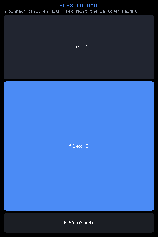
Look at the proportions: the leftover after the header, the caption and the fixed 40px row is split 1:2, so the blue panel is twice the height of the dark one above it.
// scripts/shoot.mjs, FLEX_COL_PAGEh('box', { h: gfx.height(), pad: em(1), gap: em(0.5) }, [ h('text', { text: 'FLEX COLUMN', size: 2, align: 'center', color: UI.theme.accent }), h('text', { text: 'h pinned: children with flex split the leftover height', size: 1, color: UI.theme.muted, wrap: true }), h('box', { flex: 1, bg: UI.theme.key, radius: 6, vcenter: true }, h('text', { text: 'flex 1', size: 2, align: 'center' })), h('box', { flex: 2, bg: UI.theme.accent, radius: 6, vcenter: true }, h('text', { text: 'flex 2', size: 2, align: 'center' })), h('box', { h: 40, bg: UI.theme.panel, radius: 6, vcenter: true }, h('text', { text: 'h 40 (fixed)', size: 1, align: 'center' }))]);The arithmetic:
flex: truecounts as weight 1;flex: Ncounts asN.fixedsums the measured heights of the non-flex children plus every gap between children that have height.leftover = boxH - padT - padB - fixed, floored at 0.- Each flex child is drawn with
Math.floor(leftover * fl / flexTotal)as itsforcedH. The rounding remainder is dropped, not redistributed — a three-way split of 100px gives 33/33/33 and leaves a pixel. vcenteris checked asflexTotal === 0 && p.vcenter, so a box that has a flex child never also vertically centres.
Where a height comes from at all. There are only three sources of
forcedH: a flex column’s share, a pinned row stretching a box/row
child, and UI.safe.inset pinning the root. Everything else measures
itself.
Nothing else stretches, ever. text, input, pbar, circle,
canvas and spacer each report a natural height and take it. To make one
fill a space, wrap it in a box that flexes and set vcenter.
Keys and buttons size to their content unless told otherwise. Button
is a box that passes w and h straight through and sets vcenter:
function Button(p) { return h('box', { bg: p.bg === undefined ? UI.theme.key : p.bg, radius: 6, pad: p.pad === undefined ? em(1.25) : p.pad, h: p.h, w: p.w, onTap: p.onTap, ... vcenter: true }, h('text', { text: p.label, size: p.size || 2, ... }));}With no h, a Button is label height plus padding. The built-in keyboard
hit the same wall and solved it by measuring instead of flexing:
/* Keys here size to their CONTENT -- nothing flexes -- so the space bar must be told how wide it is. Left to the glyph it would be a 30px stub, which is what the word SPACE was quietly hiding. */and for the word keys:
/* The width a key needs to actually SHOW its label: the glyphs plus a little breathing room. Keys carrying a word (123, abc, DEL, SPACE, OK) are sized from this rather than left to flex, because a flexed word key on a narrow row renders blank -- the label does not fit, so it is not drawn, and the user gets an unmarked slab. */function kbLabelW(label, size) { return label.length * fadv(size || 1) + 8;}If a control comes out the wrong size, the question is almost always which
of the two axes you left to the default: a width in a row needs w, a
height in a column needs flex and a parent with a height.
abs is page-absolute, not parent-relative
Section titled “abs is page-absolute, not parent-relative”Read this one carefully. It is the layout rule most often misremembered, and getting it wrong puts an overlay somewhere entirely different from where the source appears to place it.
} else if (t === 'abs') { /* An escape hatch from the flow: children draw at absolute screen coordinates and the row above them never learns they happened. */ for (var ai = 0; ai < node.kids.length; ai++) { var ak = expand(node.kids[ai]); var aw = (ak && ak.props && ak.props.w) ? ak.props.w : (p.w || availW); draw(node.kids[ai], p.x || 0, p.y || 0, aw, p.h); } return 0;}p.x and p.y go straight into draw. The x and y the walker
arrived with — the position the parent had reached, including its padding
— are discarded. There is no parent offset anywhere in that call.
x={0} means the left edge of the screen, not the left edge of the box
you wrote it in.
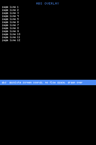
Look at the left edges. The page has pad: em(1), so every page line
starts 8px in — and the abs strip, written with x: 0 inside that same
padded box, is flush against the panel edge. That gap is the whole rule.
// scripts/shoot.mjs, ABS_PAGEh('box', { h: gfx.height(), pad: em(1), gap: 4 }, [ ... ].concat(rows).concat([ h('abs', { x: 0, y: Math.floor(gfx.height() * 0.55), w: gfx.width() }, h('box', { bg: UI.theme.accent, pad: em(0.75), shield: true }, h('text', { text: 'abs: absolute screen coords, no flow space, drawn over', size: 1, wrap: true })))]));What follows from that single line, all of it worth planning for:
- It ignores the parent’s padding and position, as the shot shows.
- It ignores
UI.safe.inset. The root is drawn at(sfL, sfT)but anabschild still lands on raw screen coordinates, sox: 0sits in the dead band on a panel with a left inset. AddUI.safe.leftyourself. - It ignores a scroll offset. A viewport draws its children at
y + padT - off, but anabsinside one draws atp.yat every offset, so it does not move with the content. Its children’s hit areas are still trimmed to the viewport by_clipHits, so it answers taps only where it overlaps the box. - It takes no flow space.
measurereturns 0 forabs, and a zero-height child consumes no gap either, so the page beneath is laid out as though the overlay were not written. - Sizing. A child’s own
wwins; otherwise the abs’sw; otherwise the width the abs was given.hon the abs is handed to the children asforcedH.
Positioning relative to anything means doing the arithmetic yourself, which
is what examples/layers does to hang a badge off the top-right corner and
a floating button above the footer:
<abs x={gfx.width() - em(5.5)} y={em(2.4)}> <box w={em(5)} bg={0xdd6644} radius={99} pad={em(0.35)}> <text text="badge" size={1} align="center" color={0xffffff} /> </box></abs>clip, offX and contentW
Section titled “clip, offX and contentW”clip={true} confines the children’s paint and their hit areas to the
box. The native gfx.clip is a single rectangle, not a stack, so the core
keeps one honest rect itself:
/* The native clip is a SINGLE rect, not a stack. Anything that clips inside something already clipped -- an input inside a scroll viewport, a clip box in a scroll row -- must INTERSECT with the active rect and restore it afterwards, or it would punch a hole in the outer clip and paint over whatever the viewport was keeping it away from (a sticky header, an overlay). */function pushClip(cx, cy, cw, ch) { ... }function popClip(prev) { ... }So a clip inside a clip is intersected with the active one and the previous
rect is restored on the way out. What you cannot get is an inner clip that
is larger than the one around it. Hit areas registered while the clip was
active are trimmed to the same rectangle afterwards by UI._clipHits.
offX slides the children left by that many pixels; contentW lets them
lay out wider than the box holding them. Both are read only in the two
non-scroll box branches — innerW = cwOv || (availW - pl - pr), then
draw(kf, x + pl - ox3, ...). A scroll viewport ignores both, because it
owns its own offset.
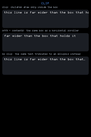
Look at the right edge of the first box — the line is cut mid-glyph, which
is what a clip does. The second box shows the same string slid 90px left.
The third has no clip, so fitText truncated it and marked the cut with
the ellipsis glyph.
// scripts/shoot.mjs, CLIP_PAGEvar long = 'this line is far wider than the box that holds it';
h('box', { h: 64, clip: true, bg: UI.theme.panel, radius: 6, pad: 6 },  h('text', { text: long, size: 2, nowrap: true })),
h('box', { h: 64, clip: true, offX: 90, contentW: 900,           bg: UI.theme.panel, radius: 6, pad: 6 },  h('text', { text: long, size: 2, nowrap: true })),
h('box', { h: 64, bg: UI.theme.panel, radius: 6, pad: 6 },  h('text', { text: long, size: 2 }))
clip + offX + contentW together is a horizontal scroller. The strip
keyboard is exactly that — one row of characters wider than the panel,
scrolled by an offset the app keeps:
h('box', { h: kh, bg: UI.theme.key, radius: 4, clip: true, vcenter: true, offX: KB.strip, contentW: contentW, ...})Note the interaction with text: by default a text node truncates to the
available width with the ellipsis glyph, so it never needs clipping.
nowrap draws the string untrimmed, which is when a clip starts mattering.
wrap word-wraps to as many lines as it takes. See
fonts.md for fitText and textLines.
Scroll zones
Section titled “Scroll zones”A box becomes a scroll viewport when scroll names an offset and the
box has a height:
if (p.scroll && boxH) { /* boxH = forcedH || p.h */forcedH counts, which is why flex: 1, scroll: 'main' inside a pinned
parent is the normal shape — the pattern both examples/layers and the
core’s Modal use. Without a height from either source, scroll does
nothing at all and the box lays out as an ordinary column.
// examples/layers/app.jsx — header, scroll region, footer<box h={gfx.height()}> <box bg={0x223048} pad={em(0.75)} h={em(3.4)}> ... </box> <box flex={1} scroll="main" pad={em(0.75)} gap={em(0.5)}> {kids} </box> <box bg={0x223048} pad={em(0.6)} h={em(3)}> ... </box></box>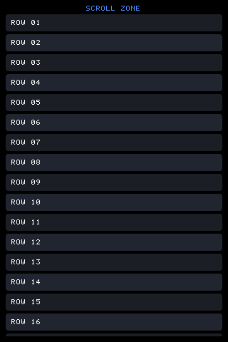
Look at the bottom edge: ROW 16 is cut off flat by the viewport rather than spilling past it.
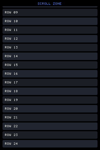
Look at the top edge now — a partial row is clipped there instead, and the list has moved as one piece. Hit areas moved with it: a control scrolled half out of sight answers only over the visible half.
// scripts/shoot.mjs, SCROLL_PAGEh('box', { h: gfx.height(), pad: em(1), gap: em(0.5) }, [ h('text', { text: 'SCROLL ZONE', size: 2, align: 'center', color: UI.theme.accent }), h('box', { flex: 1, scroll: 'list', gap: 4 }, rows)]);Named, persistent offsets. The offset lives at UI._scroll[name] and
survives every render — there is no retained tree to hold it, so the name
is the identity. UI.reset() clears them; UI.set() does not.
Order of operations inside the viewport. Content height is summed
first, so the offset can be clamped before anything paints. Then the
children draw from y + padT - off; children entirely outside the box
advance the cursor but skip their draw.
Range.
var maxOff = contentH - (boxH - padT(p) - padB(p));if (maxOff < 0) maxOff = 0;/* An overlay covering part of this viewport makes the covered band scrollable-past -- extra range at the bottom, negative offsets at the top -- so every row can still be brought into the visible part. The same idea as a native scroll view's content insets. */var covB = (y + boxH) - (gfx.height() - UI._insetBot());if (covB > 0) maxOff += covB;if (UI.isRound()) maxOff += gfx.height() >> 2;var minOff = UI._insetTop() - y;minOff = minOff > 0 ? -minOff : 0;An overlay declares its band with UI.inset('top'|'bottom', px), which is
cleared every render — the docked Keyboard calls it while it is on
screen. That is what lets a field under the keyboard still be scrolled into
view.
Gestures. The box registers itself with UI._swipeZone. A stroke that
moves past DRAG_SLOP (6px) scrolls the zone, computed absolutely from
where the drag began rather than by accumulating deltas:
if (p.key && p.far > DRAG_SLOP) { /* Absolute, from where the drag began: tracking deltas accumulates the rounding and the list drifts away from the finger. */ this._scrollTo(p.key, p.off0 - dy);On release, a velocity over 2px/frame starts a fling; each tick applies the
velocity and then decays it by v * 0.86, and the fling ends either when a
tick fails to change the offset (it has hit a limit) or when the decayed
velocity drops under 1.2.
Programmatic movement. UI.swipe(x, y, dir) moves the zone under a
point one notch, where the notch is step:
p.step === 'page' ? (boxH - padT - padB) : (p.step || 40).
UI.scrollBy(x, y, dy) moves it an exact number of pixels, which is what a
mouse wheel wants. Both find their target with _zoneAt, which walks UI._swipes backwards
and takes the last one registered under the point. A viewport registers
itself after drawing its children, so where scroll zones are nested the
outer zone is the later entry and wins. A shield is the other way
round — it registers its key-less zone before its children — which is how
it stops drags from reaching a zone it covers.
UI.scrollQuantum rounds every offset before it is stored; a terminal
backend sets it to its sub-pixels-per-cell so a fling can never park
content on an odd row.
The round end margin
Section titled “The round end margin”Round glass gets extra scroll range at the end of every zone, unconditionally:
/* Round glass: a quarter-screen of extra range, UNCONDITIONALLY, so the last rows can be lifted out of the narrow bottom arc into the wide middle. Content that FITS the square still drowns in the circle — a zone whose maxOff computed to zero is exactly the one whose bottom row is stuck in the arc. */if (UI.isRound()) maxOff += gfx.height() >> 2;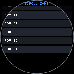
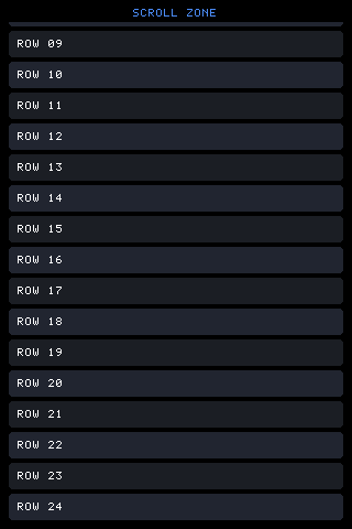
UI.isRound() reads configStorage’s 'round' key once and caches it —
the host seeds it, and the answer never changes while running. For what
else changes on a circle — UI.safe.inset, the chord a row actually has,
ArcFooter — see round.md.
z-order and overlays
Section titled “z-order and overlays”There is no z-index. Draw order is paint order, and later-drawn wins
hit-testing — UI.tap and _hitAt walk UI._hits backwards. So an
overlay is simply a node placed later in the tree.
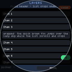
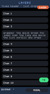
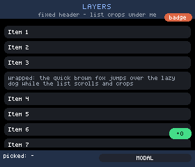
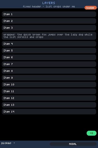
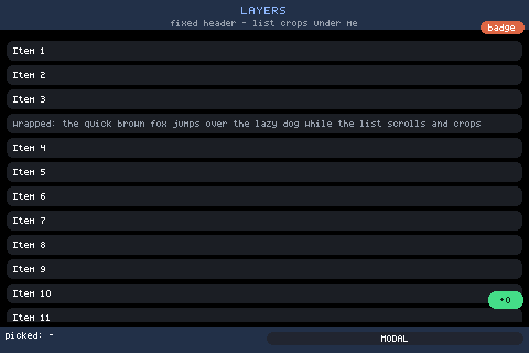
// examples/layers/app.jsx — the floating action button, last in the tree<abs x={gfx.width() - em(4.6)} y={gfx.height() - em(7)}> <box w={em(4)} bg={0x44dd88} radius={99} pad={em(0.6)} onTap={function () { UI.set({ fab: (UI.state.fab || 0) + 1 }); }}> <text text={'+' + (UI.state.fab || 0)} size={1} align="center" color={0x0c2216} /> </box></abs>Three tools go with it:
shieldmakes a box occlude what it covers. It registers a swallow-all hit before its children (so its own controls, registered after, still win) plus a key-less swipe zone. Taps between its controls die there instead of reaching covered fields, and drags over it do not scroll a zone underneath. A shield’s surface has no dead spots: a tap goes to the nearest control on it within 13px, so a keyboard has no gaps from a touch point of view. This is what an overlay panel — a keyboard, a docked toolbar — wants.UI.openModal(fn)draws the modal last, after clearing_hits,_swipesand_flings. Everything under it stops listening entirely — a dialog you can press through is not a dialog.UI.inset(side, px)reserves a band as covered, which extends the scroll range of zones that reach into it (above).
Zero-height nodes: line and path
Section titled “Zero-height nodes: line and path”line, path and abs all measure 0.
if (t === 'abs') return 0; /* drawn at its own coordinates; owns no space *//* A line is a mark, not a block: it takes no height and its endpoints are offsets from wherever the flow has got to. A box with a fixed height and lines inside it is therefore a plotting area, with no new concept needed. */if (t === 'line' || t === 'path') return 0;A zero-height child is drawn at the current flow position, and then the flow neither advances nor adds a gap — every draw loop has the same guard:
if (measure(node.kids[bi], cw3) === 0) { draw(node.kids[bi], x + pl - ox3, by, cw3); continue;}The consequence is the useful part: every mark in a box draws from that
box’s origin. Give a box a height (or a flex inside a pinned parent),
fill it with line or path children, and it is a plotting area. Note the
difference from abs: a mark’s coordinates are offsets from the flow
position, not screen coordinates.
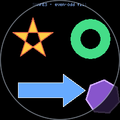
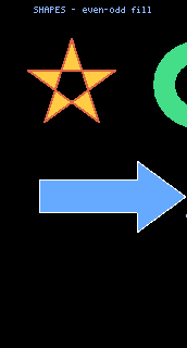
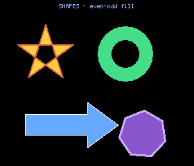
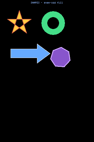
<box h={gfx.height()} pad={em(0.75)} gap={em(0.5)}> <text text="SHAPES - even-odd fill" size={1} align="center" color={0x8fb8ff} /> <box flex={1}> <path pts={star} fill={0xffcc44} color={0xdd6644} w={2} /> <path pts={donut} fill={0x44dd88} /> <path pts={arrow} fill={0x66aaff} color={0xffffff} w={1} /> <path pts={blob} fill={0x8855cc} color={0xcfa8ff} w={3} /> </box></box>Two details on the marks themselves:
linehas no native thickness, so aw-px line is drawn aswparallel 1px lines offset across the shorter axis and centred on the nominal position.pathcaches its computed stroke polygons on the node (_pg,_pgx,_pgy) and replays them when the same node is drawn again at the same position, on backends withgfx.poly. With many finished strokes on screen the outline stroker’s per-point trig is otherwise the frame’s dominant cost.
Quick reference
Section titled “Quick reference”| prop | on | what it does |
|---|---|---|
pad | box, row | uniform padding. On a row this is the only padding prop |
padL padR padT padB | box | per-side padding; falls back to pad only when undefined |
gap | box, row | space between children, default 4; zero-height children take none |
w | box, row child | box: narrows only, never widens, never re-centres. Row child: fixes that column |
h | box, row | pins the height; the node reports exactly this, content or not |
flex | box child | only inside a box that has a height. true = 1, or a weight |
vcenter | box | centre content in an outside-given height; ignored if anything flexes |
middle | row child | centre this child vertically in the row |
clip | box | confine paint and hit areas to the box; intersected with any active clip |
offX contentW | box | slide children left / lay them out wider. Ignored by a scroll box |
scroll | box | names a persistent offset; needs a height (h or flex in a pinned parent) |
step | box (scroll) | notch for UI.swipe: pixels, or 'page'. Default 40 |
shield | box | occlude what is underneath; nearest-control-within-13px on its surface |
x y | abs | screen coordinates, never parent-relative |
hitPad | box, row | grow the touch target past the paint by N px |
See also ui.md for the full element and prop list,
components.md for Button, Modal, Keyboard and
ArcFooter, fonts.md for em(), text metrics and wrapping,
and round.md for laying out on glass with no corners.