Virtual keyboards
box, row and text nodes, it registers nothing, and every key it draws
sends the same UI.key('press', name) a physical board sends. Everything
on this page lives in packages/core/src/mjsx.js between kbSend() and
Keyboard(); the code shown is lifted from there and from examples/.
If you only want the field itself — props, caret, focus order, the key path — see input.md. This page is about what draws below it.
Contents
Section titled “Contents”- The smallest call
- The five layouts, at a glance
auto: the width that decides- A named layout is honoured exactly
- Sizing:
heightandkeyH position: inline, top, bottom- Exclusive: the keyboard takes the display
- QWERTY — shift-once, two symbol pages, the bottom row
- T9 — letters-first, multi-tap, hold-for-digit, the symbol pad
- NUMBERS
- STRIP
- The space bar, and why labels are never abbreviated
- Round glass — chords, the trapezoid, OK in the arc
- A custom keyboard is just JSX
- Prop reference
- Where each behaviour lives
The smallest call
Section titled “The smallest call”A keyboard is worth drawing when something is focused, so the usual shape
is one line guarded by UI.focused(). From examples/wifi/app.jsx:
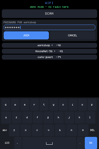
/* no layout named: this app wants "whatever types best here", which is QWERTY on a phone-ish panel and T9 on a watch */if (focused) kids.push(h(Keyboard, { position: 'bottom', height: Math.floor(gfx.height() / 2.8) }));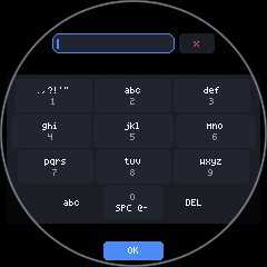
The five layouts, at a glance
Section titled “The five layouts, at a glance”layout takes 'auto' (the default), 'qwerty', 't9', 'numbers' and
'strip'. Here is every one of them docked at the bottom of a 320x480
panel and of a 172x320 panel, at the same keyH:
| 320x480 (lcd35) | 172x320 (lcd147) | |
|---|---|---|
auto | 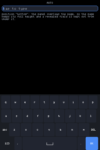 | 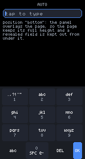 |
qwerty | 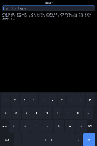 | 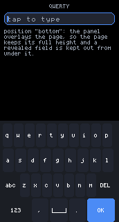 |
t9 | 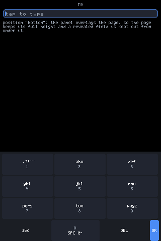 | 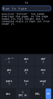 |
numbers | 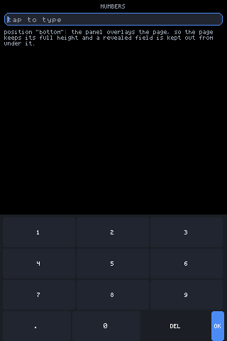 | 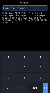 |
strip | 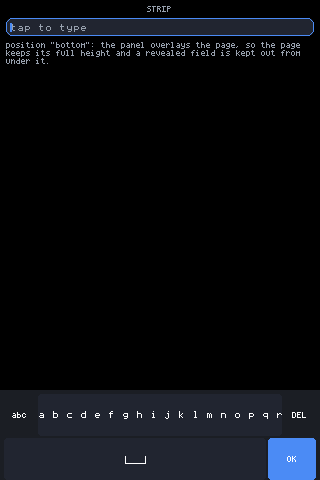 | 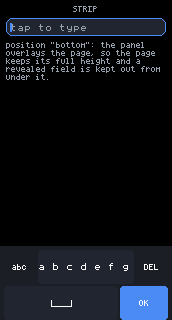 |
Read the left column against the right. auto changes what it draws —
QWERTY at 320px, T9 at 172px. The four named rows draw the same layout in
both columns, squeezed rather than substituted.
The page behind these shots is four nodes:
h('box', { h: gfx.height(), pad: 6, gap: 6 }, [ h('text', { text: LAYOUT.toUpperCase(), size: 1, align: 'center', color: UI.theme.muted }), h('input', { id: 'f', size: 2, placeholder: 'tap to type' }), h('text', { text: '...', size: 1, color: UI.theme.muted, wrap: true }), h(Keyboard, { layout: LAYOUT, position: 'bottom', height: 4 * 42 + 14 })])auto: the width that decides
Section titled “auto: the width that decides”auto is the default and it picks by width, using the thresholds in
Keyboard():
if (layout === 'auto') { /* ten columns want ~22px each; T9's four want ~28px; below that only the single scrolling row of STRIP is honestly tappable */ layout = kbW >= 220 ? 'qwerty' : (kbW >= 115 ? 't9' : 'strip');}The number that matters is kbW, and it is not the bounding box. On
round glass the keys never get the full display width — the bottom rows sit
near the rim, where the circle has run out. So kbW is measured as the
chord across the band the bottom rows will occupy:
var kbW = gfx.width();if (UI.isRound()) kbW = kbChordHW(gfx.height() * 0.72, gfx.height() * 0.86) * 2;kbChordHW(yTop, yBot) returns half the chord across a horizontal band,
constrained by whichever edge of the band is farther from the middle, minus
a hair for the bezel:
function kbChordHW(yTop, yBot) { var c = gfx.height() / 2, r = c - 2; var a = yTop < c ? c - yTop : yTop - c; var b = yBot < c ? c - yBot : yBot - c; if (b > a) a = b; if (a >= r) return 0; return Math.floor(Math.sqrt(r * r - a * a)) - 3;}Run the numbers for a 240x240 circle: the band is y 172.8 to 206.4, the
farther edge is 86.4px from centre, r is 118, so the half-chord is
floor(sqrt(118² − 86.4²)) − 3 = 77 and kbW is 154 — comfortably
inside T9’s band and nowhere near QWERTY’s 220. A display advertised as
240px wide gets a T9 keyboard, and that is the correct answer, not a
rounding accident.
| Glass | kbW | auto picks |
|---|---|---|
| 480x320 desktop window | 480 | qwerty |
| 320x480 panel | 320 | qwerty |
| 172x320 panel | 172 | t9 |
| 240x240 round | 154 (chord) | t9 |
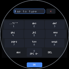
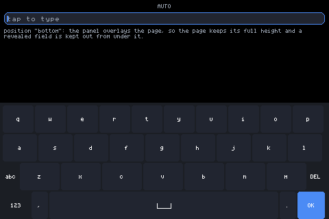
A named layout is honoured exactly
Section titled “A named layout is honoured exactly”Passing a layout is a decision, not a hint. There is no fallback, no
downgrade and no width check — the named layout draws, however cramped, and
the round insets below keep even a squeezed QWERTY on the glass rather than
under the bezel.
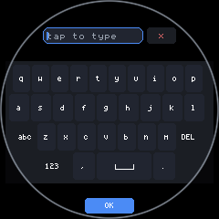
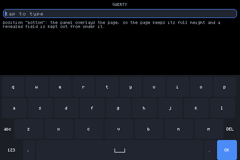
Apps that want the choice exposed can just cycle the string.
examples/input/app.jsx does, with a row of chips:
var LAYOUTS = ['auto', 'qwerty', 't9', 'numbers', 'strip'];chips.push(h(Button, { label: LAYOUTS[i].toUpperCase(), size: 1, pad: em(0.6), bg: kb === LAYOUTS[i] ? UI.theme.accent : UI.theme.key, onTap: (function (l) { return function () { UI.set({ kb: l }); }; })(LAYOUTS[i])}));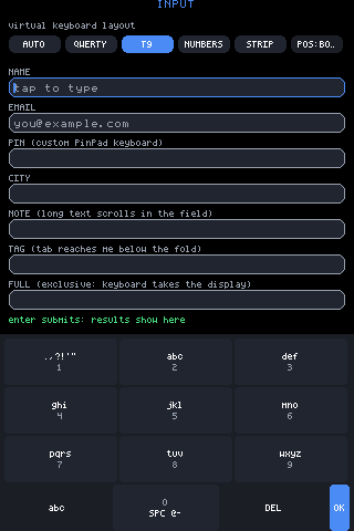
The selected chip lights UI.theme.accent and the keyboard under it
changes on the next frame.
Sizing: height and keyH
Section titled “Sizing: height and keyH”height is a hint for the whole keyboard; the keys are what scale to
fit it, divided by the row count the layout needs:
var rowsN = layout === 'strip' ? 2 : 4;var kh;if (p.height) kh = Math.floor((p.height - 8 - (rowsN - 1) * 2) / rowsN);else kh = p.keyH || (flh(2) + em(1));if (kh < 8) kh = 8;height— total height to fit into. The 8 is the panel’s own padding, the(rowsN - 1) * 2its row gaps.keyH— sets one key’s height directly, and lets the panel be whatever that adds up to.- Neither —
flh(2) + em(1), a size-2 line box plus a line of breathing room, which follows the active font rather than a pixel constant.
Row count is four for everything but STRIP, which is two. T9 and the number pad used to spend a whole row on the single OK key; they now put it on the utility row instead, so every other key on those layouts is taller for it.
position: inline, top, bottom
Section titled “position: inline, top, bottom”h(Keyboard, { layout: 'qwerty', position: 'bottom', height: 4 * 34 + 14 })'inline' is the default: the panel is an ordinary child and takes flow
space like any other.
'bottom' and 'top' make it an overlay pinned to that screen edge. It
takes no flow space at all — the page keeps its full height and the
keyboard draws over it:
var totalH = rowsN * kh + (rowsN - 1) * 2 + 4; /* one padded edge: the docked side has none */UI.inset(pos, totalH + (pos === 'top' ? sfKT : sfKB));return h('abs', { x: sfKL, y: pos === 'top' ? sfKT : gfx.height() - totalH - sfKB, w: gfx.width() - sfKL - sfKR}, panel);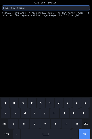
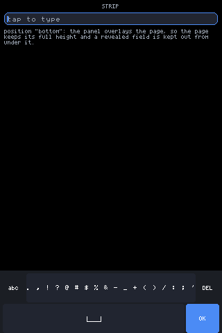
position="bottom": the panel overlays the page, which keeps its full
height. The UI.inset() call tells scroll-into-view how much of the screen
is covered, so a revealed field lands above the keyboard, not under it.
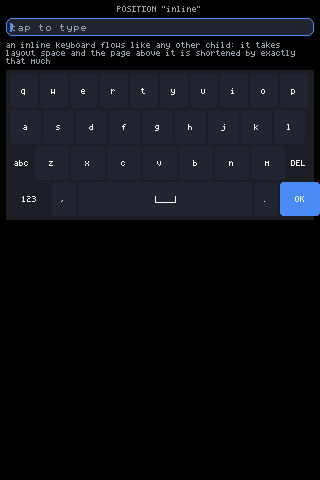
position="inline": the same keyboard as an ordinary child in the flow.
It takes layout space, and the page above is shortened by exactly that
much.
Three details of the docked panel are deliberate:
shield: true. A press that lands between two keys dies on the panel instead of falling through to whatever the overlay covers. A shield also has no dead spots — a press on its surface goes to the nearest control within ~13px.- The docked edge loses its padding (
padB: pos === 'bottom' ? 0 : undefined), so the outermost row runs flush to the screen edge and owns every clamped edge press. UI.safe.insetdecides whether the dock sits at the true screen edge or inside the safe rect. By default it is the true edge, because the safe-band hit extension already sends presses from below the last row onto it.
The panel is memoised, so a keystroke does not rebuild ~40 nodes:
var panel = UI.memo('_kbPanel', [layout, kh, pos, KB.shift, KB.page, KB.strip, KB.t9k, KB.t9i, KB.t9s, KB.stripSym, p.bg, gfx.width()], function () { ... });Everything read at draw time — the field’s text, the caret, scroll offsets — needs no dep, because the nodes are reused but the drawing still happens every frame.
Exclusive: the keyboard takes the display
Section titled “Exclusive: the keyboard takes the display”There are two ways into the full-display keyboard, and they produce exactly the same view.
Opt in, per field, with exclusive on the input:
h('input', { id: 'f', size: 2, placeholder: 'tap to type', label: 'SSID', exclusive: true })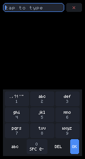
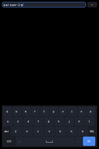
Or let it trigger itself. If the docked keys work out under a finger’s height, docking is a fiction, so the keyboard takes the display instead:
/* AUTO-EXCLUSIVE: if the docked keys come out under a finger's height, docking is a fiction -- take the whole display instead, exactly as an input's `exclusive` prop would. A short landscape (172px glass) hits this on every layout; nobody should have to opt in to legible keys. */if (!UI._exclusive && UI._focus && kh < 30) { UI._exclusive = true; UI._dirty = true;}30px is the threshold. A 172x320 panel asked for a keyboard of
gfx.height() / 2.6 crosses it on every layout.
UI._revealFocus() is the third route in: when a fixed field is covered by
an overlay, or a scroll zone has less viewport left than the field is tall,
no amount of scrolling can help and it flips the same flag.
The mirror IS the field
Section titled “The mirror IS the field”The full-display view draws a second input node above the keys. It is not
a copy, and there is no synchronisation code — input state is keyed by
id, so a node with the same id is the same field:
h('input', { id: UI._focus, size: xsz, password: xp.password, maxLen: xp.maxLen, placeholder: xp.placeholder, label: xp.label, value: xp.value, onChange: xp.onChange, onSubmit: xp.onSubmit, focusable: false })The props come from UI._inputs[UI._focus].p, which the original field
stashed on its last draw — so the mirror inherits everything the original
was configured with. focusable={false} keeps it out of the focus order
and leaves the original’s remembered position alone.
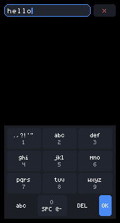
Text typed into the mirror: same text, same caret, same onSubmit. When
the keyboard closes, the original field already has it.
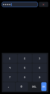
The mirror carries the original’s props, so a password field stays
masked in the takeover — and the number pad grows into the height the
display just handed it.
Key heights in exclusive mode are recomputed to use the whole display, never smaller than the docked size and capped so a two-row STRIP does not become comically tall:
var xkh = Math.floor((xRoom - 8 - (rowsN - 1) * 2) / rowsN);if (xkh < kh) xkh = kh;var xMax = (flh(2) + 2) * 3;if (xkh > xMax) xkh = xMax;header={true} on the Keyboard adds an opt-in muted label line above the
mirror, taken from the field’s label or, failing that, its placeholder.
Without it the close key rides with the mirror at full input height — one
obvious target, no header chrome.
QWERTY
Section titled “QWERTY”
Shift is shift-once
Section titled “Shift is shift-once”Phone style: one uppercase character, then it clears itself.
function kbCap(str) { return KB.shift ? str.toUpperCase() : str; }function kbTapChar(ch) { kbSend(kbCap(ch)); if (KB.shift === 1) KB.shift = 0; /* shift-once, phone style */ UI._dirty = true;}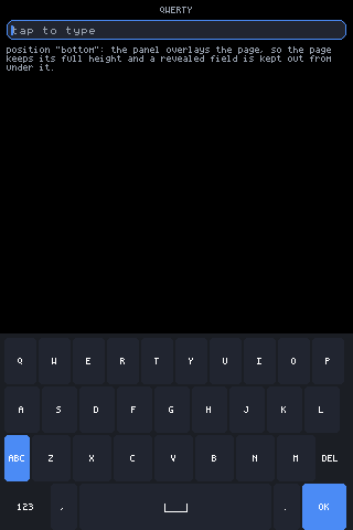
Shift active: the key fills with UI.theme.accent, reads ABC, and every
letter face on the board uppercases with it. The next character clears it.
Two symbol pages
Section titled “Two symbol pages”KB.page is 0 for letters, 1 for the first symbol page and 2 for the
second. The 123 key on the bottom row moves between letters and page 1;
the third-row key, which reads #+= on page 1 and 123 on page 2, flips
between the two symbol pages.
h('row', { gap: 2 }, kbCharRow(letters ? 'qwertyuiop' : (sym2 ? '[]{}<>()^~' : '1234567890'), kh)),h('row', { gap: 2 }, kbCharRow(letters ? 'asdfghjkl' : (sym2 ? '*/\\|=+-#%' : '@#$%&-+()'), kh)),with the third row’s letters being zxcvbnm, _"':;!? and `$&"':;
respectively.
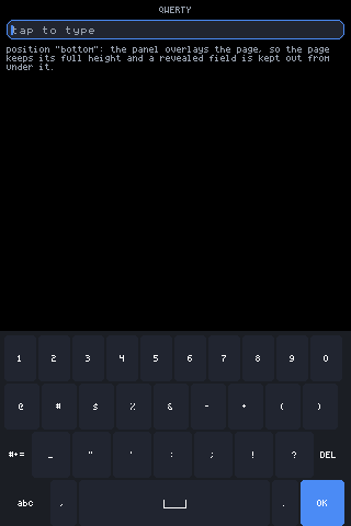
Page 1: the digits and the common punctuation.
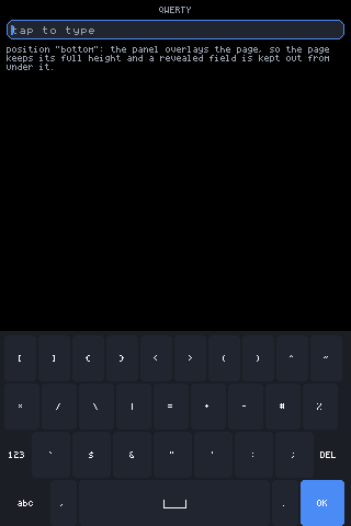
Page 2, one #+= further: brackets, backslash, pipe, tilde, backtick.
Between the two pages every glyph the font carries is typeable.
The bottom row fits itself to the width it gets
Section titled “The bottom row fits itself to the width it gets”The bottom row was built from fixed em widths, which on a narrow row — a
portrait phone panel, and above all the bottom chord of round glass — added
up to more than the row had. What gave was the space bar, the only key that
flexed, and it shipped collapsed.
The fix is not to abbreviate. A key reading 1 or < tells you less than
nothing. What drops instead is the punctuation, which is a convenience
and lives on the symbol page anyway:
var nP = (modeW + okW + punct * 2 + spaceMin + gap * 4 <= W) ? 2 : 0;if (nP === 0) { /* down to three keys: hand the words exactly what they need and let the space bar have everything else */ modeW = kbLabelW(modeLbl); okW = kbLabelW('OK');}Comma and period leave together, and the three keys that remain — 123,
space, OK — are sized from the words they carry, so each stays readable
at any width worth calling a keyboard. Compare the bottom rows of
the 480px shot (comma and period present) with
the round one (three keys, no punctuation).
Keys arrive as keys
Section titled “Keys arrive as keys”Every key on the board goes out as a full down/press/up stroke:
function kbSend(k) { UI.key('down', k); UI.key('press', k); UI.key('up', k); }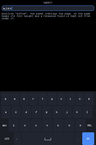
Four taps on the glass. They reached the field by exactly the road a physical keyboard’s keys take — the keyboard has no privileged channel to the input.
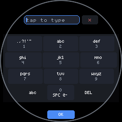
The table is a plain array, one string per key, and the last character of each is that key’s digit:
var T9 = ['.,?!\'"1', 'abc2', 'def3', 'ghi4', 'jkl5', 'mno6', 'pqrs7', 'tuv8', 'wxyz9', ' @-0'];Key 1 carries the punctuation, quotes included; the space key cycles
space → @ → - → 0, so addresses and dashes are typeable without
leaving the pad.
Multi-tap
Section titled “Multi-tap”Tapping the same key again inside a 900ms window replaces the character
rather than appending one. It does this by sending a Backspace and then
the next character — through the normal editing path, so it works on any
focused field with no special support:
function kbT9Tap(ki) { var cyc = ki === 9 ? T9[9] : t9Table()[ki]; var now = sys.millis(); if (KB.t9k === ki && KB.t9t > now) { KB.t9i = (KB.t9i + 1) % cyc.length; kbSend('Backspace'); } else { KB.t9i = 0; } KB.t9k = ki; KB.t9t = now + 900; kbSend(kbCap(cyc.charAt(KB.t9i))); ...}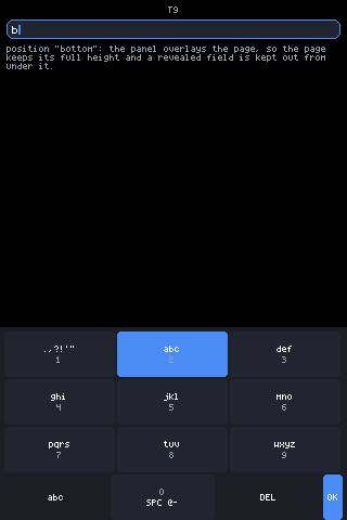
Two taps on the abc key inside the window: a has been replaced by b,
and the key holds the accent fill for as long as the window is open. Commit
is the window lapsing — a 920ms timer clears KB.t9k, and shift-once
survives the whole cycle so every resend of the same letter keeps its case.
Hold for the digit
Section titled “Hold for the digit”A long press on any character key sends that key’s digit, phone style. It works from the symbol pad too, because the position is the digit:
onLongPress: function () { KB.t9k = -1; kbSend(T9[ki].charAt(T9[ki].length - 1)); UI._dirty = true;}The symbol pad
Section titled “The symbol pad”A long press of abc opens a second table, where each key multi-taps a
themed set — so the whole face is reachable from nine keys:
var T9S = ['.,;:', '\'"`', '?!~', '@#&', '$%^', '-_=', '()[]', '{}<>', '*/\\|+'];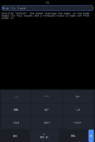
On the symbol pad the cycle is the key face — what you see on the key
is what tapping it repeatedly walks through. The space key keeps its own
SPC @- cycle. A tap of abc returns to letters.
NUMBERS
Section titled “NUMBERS”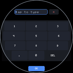
function kbNumbers(kh, okElsewhere) { var out = [], grid = ['123', '456', '789']; for (var r = 0; r < 3; r++) { out.push(h('row', { gap: 2 }, kbCharRow(grid[r], kh))); } var util = [ kbKey('.', function () { kbSend('.'); }, { h: kh, size: 2 }), kbKey('0', function () { kbSend('0'); }, { h: kh, size: 2 }), kbDelKey(kh) ]; if (!okElsewhere) util.push(kbOkKey(kh, kbLabelW('OK'))); out.push(h('row', { gap: 2 }, util)); return out;}DEL auto-repeats while held (onHold with holdEvery: 120), which is true
of every layout’s DEL — it is the same kbDelKey().
layout="numbers" on a 172x320 panel: auto-exclusive fires, and the pad
grows into the whole display with the masked field mirrored above it.
For glass with no room for a grid at all: one scrolling row of characters, drag to scroll, tap to type.
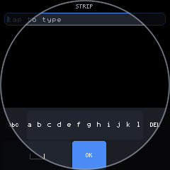
The character set is 26 letters, ten digits and 21 punctuation marks — 57 cells:
var STRIP_CHARS = 'abcdefghijklmnopqrstuvwxyz0123456789.,!?@#$%&-_+()/:;\'"*=';Drag versus tap is decided by DRAG_SLOP (6px) inside a whole-stroke
onDraw handler, not by two separate gestures:
onDraw: function (phase, lx, ly, id) { if (phase === 0) { KB.stripG = { x0: lx, o0: KB.strip, moved: 0 }; return; } var g = KB.stripG; if (!g) return; var dx = lx - g.x0; if (dx > DRAG_SLOP || dx < -DRAG_SLOP) g.moved = 1; if (g.moved) { ... KB.strip = ...; UI._dirty = true; } if (phase === 2) { if (!g.moved) { var idx = Math.floor((lx + KB.strip) / cell); if (idx >= 0 && idx < chars.length) kbTapChar(chars.charAt(idx)); } KB.stripG = null; }}A long press of abc swaps in a 33-character symbol strip and resets the
scroll to 0:
STRIP_SYMS, everything the face carries that is not a letter or digit.
Same interaction: drag to scroll, tap to type.
Two widths are clamped so the row cannot eat itself: the side keys shrink
if they would crowd the strip below three cells, and OK on the second row
is capped at a third of the row so the space bar is never starved.
The space bar, and why labels are never abbreviated
Section titled “The space bar, and why labels are never abbreviated”The space bar wears a drawn mark rather than a word — the ␣ glyph, a rule
with turned-up ends, built from three line nodes:
function kbSpaceKey(kh, keyW) { var w = em(2.5), a = Math.max(3, Math.round(kh / 6)); var mid = Math.round(kh / 2) + Math.round(a / 2); var c = UI.theme.text; var pad = keyW ? Math.max(0, Math.floor((keyW - w) / 2)) : 0; var glyph = h('box', { w: w, h: kh }, [ h('line', { x1: 0, y1: mid, x2: w, y2: mid, color: c }), h('line', { x1: 0, y1: mid - a, x2: 0, y2: mid, color: c }), h('line', { x1: w, y1: mid - a, x2: w, y2: mid, color: c }) ]); return h('box', { bg: UI.theme.key, radius: 4, h: kh, w: keyW, padL: pad, onTap: function () { kbSend(' '); } }, glyph);}Three lines ask nothing of the font, so the mark renders on every backend, and it fits any key wide enough to press — which the word SPACE does not. The key is told its width explicitly, because nothing in a keyboard row flexes; left to the glyph it would be a stub, which is what the word SPACE was quietly hiding.
The same principle governs the word keys. A flexed word key on a narrow row renders blank — the label does not fit, so it is not drawn, and the user gets an unmarked slab. So word keys are sized from their word:
function kbLabelW(label, size) { return label.length * fadv(size || 1) + 8;}123, abc, DEL, OK and the shift key all take their width from this
rather than being left to flex. Nothing is ever shortened to 1 or < to
make room; the punctuation drops out instead.
Round glass
Section titled “Round glass”Round glass is where all of the above stops being theoretical.
Every row gets its own chord
Section titled “Every row gets its own chord”A round keyboard is a trapezoid. The bottom row is nearest the rim, so
it has the narrowest chord, and an un-inset layout puts space and OK half
under the bezel. kbRoundRow() pads each row to the chord at its own
height:
function kbRoundRow(row, yTop, yBot, owned) { var pad = Math.floor(gfx.width() / 2 - kbChordHW(yTop, yBot)) - (owned || 0); if (pad < 0) pad = 0; var full = gfx.width() - (owned || 0) * 2; return h('box', { w: full, padL: pad, padR: pad }, [row]);}The width is explicit, not implied. A box left to size itself takes its content’s width, and a row whose only flexible member is the space bar then reports the width of its fixed keys alone — the space bar collapses and the whole row huddles in the middle, narrower than the letters above it. Giving the box the full display width makes the pad an inset rather than a shrink-wrap.
The mirror is pushed off the top arc
Section titled “The mirror is pushed off the top arc”At y=0 the chord is nothing; a tenth of the way down it is wide enough to hold a text field and its close key. So exclusive mode on round glass shifts the mirror down and gives the bottom back some room too:
var xTopPad = UI.isRound() ? Math.round(gfx.height() * 0.10) : 0;var xBotPad = UI.isRound() ? Math.round(gfx.height() * 0.12) : 0;The keys lose that height, which is the right trade — a text field you cannot read is worse than a slightly shorter keyboard.
OK is parked in the bottom arc
Section titled “OK is parked in the bottom arc”The sliver below the keys is space the grid can never use, because a
full-width row down there would be mostly bezel. So OK lives there and
costs the keyboard no height at all:
var okInArc = UI.isRound() && layout !== 'strip' && !!UI._exclusive;The UI._exclusive term matters: only the full-display view draws the arc,
so only it may take OK out of a layout’s own rows. Deciding this from the
shape alone left a docked round T9 with no OK key at all — dropped from the
row, with no arc to put it in.
It is sized to the circle where it actually sits, since a key wider than its own chord has its bottom corners under the bezel:
var okW2 = Math.min(kbChordHW(okTop, okTop + okH2) * 2, em(10));if (okW2 < kbLabelW('OK')) okW2 = kbLabelW('OK');STRIP is the exception
Section titled “STRIP is the exception”STRIP has two rows, not four, so its keys stay above the 30px threshold and it stays docked. A docked panel is not chord-inset — the insets only run in the exclusive branch.
A custom keyboard is just JSX
Section titled “A custom keyboard is just JSX”There is nothing to register, subclass or implement. Any view whose taps
call UI.key('press', name) or UI.type("...") is a keyboard. The
built-in one has no privileged channel — kbSend() is three UI.key()
calls.
examples/input/app.jsx swaps in its own pad for one field:
function PinPad() { var rows = [['1', '2', '3'], ['4', '5', '6'], ['7', '8', '9'], ['DEL', '0', 'OK']]; var kids = []; for (var r = 0; r < rows.length; r++) { var ks = []; for (var c = 0; c < 3; c++) { ks.push(h(Button, { label: rows[r][c], size: 2, pad: em(0.75), bg: rows[r][c] === 'OK' ? UI.theme.accent : rows[r][c] === 'DEL' ? UI.theme.panel : UI.theme.key, onTap: (function (k) { return function () { if (k === 'DEL') UI.key('press', 'Backspace'); else if (k === 'OK') UI.key('press', 'Enter'); else UI.type(k); }; })(rows[r][c]) })); } kids.push(h('row', { gap: 2 }, ks)); } return h('box', { bg: UI.theme.panel, pad: 4, gap: 2 }, kids);}and picks between them on focus:
kids.push(focused === 'pin' ? h(PinPad, {}) : h(Keyboard, { layout: kb, position: pos, height: Math.floor(gfx.height() / 2.6) }));A custom keyboard that overlays the page should do the two things the
built-in one does: set shield: true on its panel so presses between keys
do not fall through, and call UI.inset('bottom', px) while it is on screen
so scroll-into-view keeps revealed fields clear of it. It can also read
UI.exclusive() and take the display the same way.
Prop reference
Section titled “Prop reference”| Prop | Default | Meaning |
|---|---|---|
layout | 'auto' | 'auto', 'qwerty', 't9', 'numbers', 'strip'. Named layouts are honoured exactly. |
height | — | Total height to fit the whole keyboard into; keys scale to it. |
keyH | flh(2) + em(1) | One key’s height, when height is not given. |
position | 'inline' | 'inline' flows; 'bottom' / 'top' overlay that screen edge and register an inset. |
bg | UI.theme.panel | Panel fill. |
header | falsy | In exclusive mode, add a muted label line above the mirror from the field’s label or placeholder. |
State that is not a prop: shift, symbol page, T9 cycle position and
strip offset live in the module-local KB object, because one keyboard is
on screen at a time.
var KB = { shift: 0, page: 0, t9k: -1, t9i: 0, t9t: 0, t9s: 0, strip: 0, stripSym: 0, stripG: null };Where each behaviour lives
Section titled “Where each behaviour lives”All in packages/core/src/mjsx.js:
| Behaviour | Function |
|---|---|
| Key dispatch (down/press/up) | kbSend() |
| Shift-once | kbCap(), kbTapChar() |
| Word-key sizing | kbLabelW() |
The ␣ mark | kbSpaceKey() |
| DEL with auto-repeat, OK | kbDelKey(), kbOkKey() |
| QWERTY rows and symbol pages | kbQwerty() |
| The self-fitting bottom row | kbBottomRow() |
| Number pad | kbNumbers() |
| T9 tables, multi-tap, hold-for-digit | T9, T9S, kbT9Tap(), kbT9Key(), kbT9() |
| Strip and its symbol set | STRIP_CHARS, STRIP_SYMS, kbStrip() |
| Round chord maths | kbChordHW(), kbRoundRow() |
| Layout choice, sizing, docking, exclusive | Keyboard() |
| The key path into the field | UI.key(), UI.type(), UI._editKey() |