Fonts and text
tall one line is. Everything else — which glyphs exist, how they are turned into pixels — belongs to a backend. This page covers both halves, because the seam between them is where the surprises live.
The engine is packages/core/src/mjsx.js; the font registry and the size
picker are packages/core/src/fonts.js; the glyph tables are
font4x6.js, font6x8.js and font5x7.js beside them.
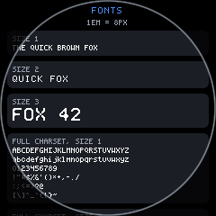
examples/fonts/app.jsx is the worked example, and every screenshot on
this page is that example rendered by scripts/shoot.mjs.
- What the core knows about text
- The three faces
- Sizes, and the AUTO ladder
- The glyph repertoire
- em(), and the alignment quantum
- Who owns FONT: the backend
- Text props
- fitText and textLines
- Quick reference
What the core knows about text
Section titled “What the core knows about text”One object and four functions:
/* Default font metric: a fixed-width bitmap font, 6px advance per char per * size step, 8px line height. This is the one place mjsx-core assumes * something about the font — a backend with a variable-width or vector font * can override fitText/textLines (or the FONT object below) without * touching layout/draw. */var FONT = { advance: 6, lineH: 8 };
function fadv(size) { return FONT.pick ? FONT.pick(size).advance : FONT.advance * size; }function flh(size) { return FONT.pick ? FONT.pick(size).lineH - 2 : FONT.lineH * size; }fadv(size)— the advance, in pixels, of one character at that size.flh(size)— the glyph height at that size. The line pitch isflh(size) + 2, so atextnode with N lines measuresN * (flh(size) + 2) - 2.fink(size)— the visible cap-ink height, which is shorter than the line box because the box carries leading (and, in the 6x8 family, a blank baseline row under the caps).inputcentres on this rather than on the line box, because centring the line box leaves the text riding high.em(n)— spacing in line-heights. Its own section below.
Two consequences of these being the only text facts in the engine:
Text is monospaced by construction. Every width the engine computes is
str.length * fadv(size) — used for align, for truncation, for
wrapping. A backend with a proportional face would have to override
fitText and textLines as well as FONT.
A bare string child is not the same as a text node. A string or
number child renders as a size-1 line and measures FONT.lineH — the raw
field, not flh(1). With the ladder installed that is 8px where
<text size={1}> measures 6. Use a text node when the height matters.
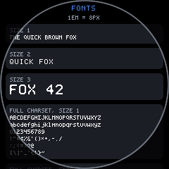
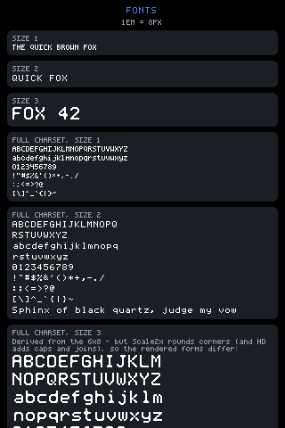
<box pad={em(1)} gap={em(0.75)} h={gfx.height()} scroll="fonts"> <text text="FONTS" size={2} align="center" color={UI.theme.accent} /> <text text={'1EM = ' + em(1) + 'PX'} size={1} align="center" color={UI.theme.muted} /> ...</box>The three faces
Section titled “The three faces”Three hand-drawn tables, plus a family of members derived from them.
| name | cell | advance | detail d | family |
|---|---|---|---|---|
4x6 | 4x6 | 5 | 6 | 4x6 |
6x8 | 6x8 | 7 | 8 | 6x8 |
12x16 | 12x16 | 13 | 8 | 6x8 |
4x6 is the original, drawn by hand. 6x8 is also hand-drawn — 5x7
letterforms set in a 6x8 cell — which is why its detail is 8 where 4x6’s
is 6. 12x16 is not drawn at all: it is Scale2x of 6x8, so it inherits
that family and that detail.
The registry builds the rest of the ladder the same way — 8x12, 16x24
and 32x48 from 4x6; 24x32 from 12x16; 12x18 and 18x24 by
Scale3x — so a family has exact 1x/2x/3x/4x members and a precise (dpr)
renderer can hit every scale without falling back to blocky stamping.
FONTS['8x12'] = { glyphs: scale2x(FONTS['4x6'].glyphs, 4, 6), w: 8, h: 12, d: 6, fam: '4x6' };FONTS['12x16'] = { glyphs: scale2x(FONTS['6x8'].glyphs, 6, 8), w: 12, h: 16, d: 8, fam: '6x8' };Two fields on each entry matter later:
dis the native detail: the glyph height of the hand-drawn source it came from. “A derived font is smoother than plain doubling but carries no more real detail than the font it came from” — the picker usesdto prefer a genuinely sharper face over a bigger-but-blockier one.famis the hand-drawn family the letterforms belong to. Precise rendering upgrades resolution within a family, so 4x6-class text keeps looking like the 4x6 and never silently swaps face.
There is a fourth face, 5x7, the Adafruit GFX classic. It exists so a
browser replaying the bridge firmware’s op stream draws the same glyphs on
the same 6px advance. It is fixed-face only (opts.font = '5x7') and
never appears in the size ladder.
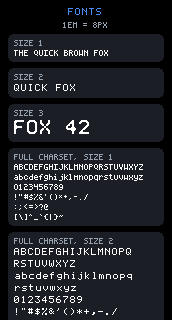
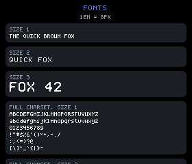
Pinning a face makes the difference plain. Each of these is the same
examples/fonts source with one face forced for every size:
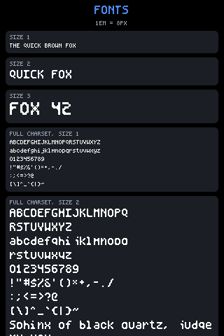
--font=4x6. Look at the header: 1EM = 8PX. Sizes 1, 2 and 3 are now
the same 4x6 glyphs at 1x, 2x and 3x, so size 3 is a magnified 4x6 rather
than a different face.
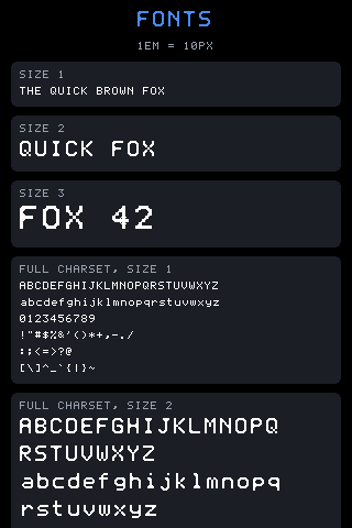
--font=6x8. 1EM = 10PX — pinning the face changed em, and every
padding and gap in the page authored with em() grew with it, without a
number in the source changing.
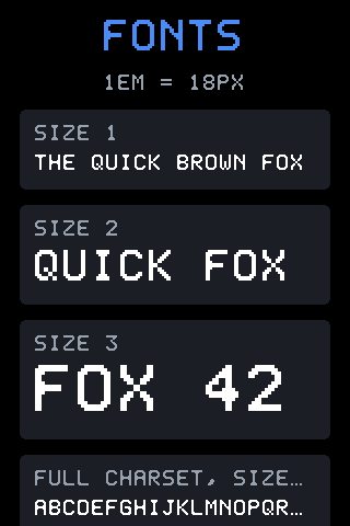
--font=12x16. 1EM = 18PX, and “size 1” is now the full 12x16 face.
Look at the last panel’s heading: FULL CHARSET, SIZE… — at this advance
the label no longer fits its box, so fitText truncated it.
Sizes, and the AUTO ladder
Section titled “Sizes, and the AUTO ladder”By default no face is pinned. A size names a target height, and the
picker returns the sharpest face that fits it:
/* Per-size font selection — the point of having several fonts at all. A * text size names a TARGET height (6px per step, the historic 4x6 ladder) * and the picker NEVER exceeds it, so text cannot overflow a box authored * against the linear ladder. Among the candidates that fit within one step * below the target, the SHARPEST font wins (highest native detail d, then * taller, then less scaling) — a crisp 6x8 beats a fat doubled-4x6 that * happens to be taller, which is the whole point of "larger should be * CLEARER". Only when nothing lands in that band does plain * largest-that-fits apply. Scales are integers (1x/2x), never fractional. */function pickFont(size) { ... }The candidates are [4x6, 6x8, 8x12, 12x16, 16x24] at 1x and 2x, and the
target height is size × 6 — 6, 12, 18, 24. What that resolves to:
size | face picked | fadv | flh | line pitch |
|---|---|---|---|---|
| 1 | 4x6 at 1x | 5 | 6 | 8 |
| 2 | 6x8 at 1x | 7 | 8 | 10 |
| 3 | 12x16 at 1x | 13 | 16 | 18 |
| 4 | 16x24 at 1x | 17 | 24 | 26 |
Every one of them lands at 1x, which is the point of the ladder: there is always a drawn or Scale2x’d member close enough that nothing needs stamping.
Size 2 is the rule in action: 8x12 at 1x is also 12px tall and also fits,
but 6x8’s detail is 8 against 8x12’s 6, so the crisper hand-drawn face
wins over the doubled one. Size 3 is the tie-break after that: 6x8 at 2x
and 12x16 at 1x are both 16px with detail 8, and the last key prefers
less scaling, so 12x16 takes it. Size 4 has no 6x8-family member that
fits under 24px, so it falls back to the 4x6 family’s 16x24.
The result is picked once per size and memoised in _pickMemo.
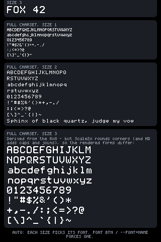
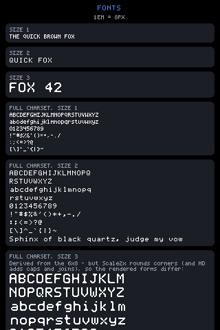
Look at the three CHARSET panels together: the same characters in three
different faces. Size 1’s S is a 4x6 approximation, size 2’s is the
hand-drawn 6x8 letterform, size 3’s is that letterform Scale2x-smoothed —
corners rounded, not merely doubled.
The glyph repertoire
Section titled “The glyph repertoire”Both hand-drawn faces carry the same 96 glyphs: printable ASCII,
U+0020 through U+007E, plus U+2026, the ellipsis. Nothing else. Not a
code page, not Latin-1 — the tables were grown as examples needed them, and
they are now identical in coverage.
U+2026 is there for one purpose: truncation marks the cut with a single
ellipsis glyph instead of three dots, which keeps two more characters of
the actual text.
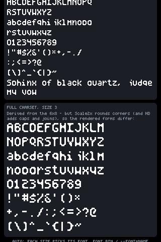
Look at the lowercase row and the descenders on g, p, q, y. Look
also at the wrapped line near the top — Sphinx of black quartz, judge my vow broke into two lines on a word boundary, which is wrap and
textLines, not the font.
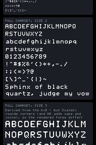
The same character set in the clearer face: real diagonals and curves the 4x6 grid cannot express. Same repertoire, different letterforms.
A table is rows of column bitmasks, bit (w - 1) being the leftmost
column, and that one shape serves every face:
// packages/core/src/font6x8.js — 'A' in a 6x8 cellvar FONT6x8 = { 'A': [28, 34, 34, 62, 34, 34, 34, 0], 'B': [60, 34, 34, 60, 34, 34, 60, 0], ...Two details in the tables themselves:
- Descenders live below the cell. The 4x6 glyph arrays are
variable-length:
g j p q yuse row 6, below the 6-row cell, inside the line pitch’s spacing rows, which is what real descenders do. A rasterizer drawsrows.lengthrows, not a fixed cell height. - A missing glyph is a blank cell, not an error. The pure-js backend
case-folds to uppercase where the face has no lowercase, and otherwise
skips:
if (!rows) continue; // unknown glyph: skip rather than draw noise. The advance is still consumed, because the cell position is computed from the character index. Layout is unaffected either way —fadvcounts characters, not glyphs.
How the bitmaps become pixels is the backend’s business, not the core’s,
and it varies: stamping at an integer scale, AdvMAME-smoothed stamping
(on by default for hand-drawn faces at 2x and above; derived members are
already Scale2x products and would mush if smoothed twice), or stroke
vectorization at dpr > 1. See contract.md.
em(), and the alignment quantum
Section titled “em(), and the alignment quantum”em(n) is the spacing unit. It is n line-heights of the current font
metric, resolved at call time:
/* Text-relative spacing, like CSS em: n line-heights, resolved against the * CURRENT font metric at call time. Padding and gaps authored with this * stay proportional to the text when a backend swaps the font scale — a * terminal (lineH 2) tightens to a quarter of a pixel panel (lineH 8) * automatically, instead of keeping panel-sized gutters around tiny text. * * FONT.quantum (default 1) is the alignment unit em snaps to. A terminal * backend sets it to its sub-pixels-per-cell so every em-derived offset * lands on a whole character row — an odd-sub-pixel gap would put every * box edge below it mid-cell, rendering as a dashed half-block hairline. */function em(n) { var q = FONT.quantum || 1; var v = Math.round(n * FONT.lineH / q) * q; return v < q ? q : v;}Three things to hold onto:
emreadsFONT.lineH, notflh(size). It is one number for the whole page, taken from the size-1 metric the backend published. It does not vary with thesizeof the text near it.emfollows the FACE, not the panel. Pinning--font=6x8changedem(1)from 8 to 10 in the shots above. Moving the same page to a smaller screen does not change it at all.- It never returns 0.
em(0.1)on a quantum-1 backend rounds to 1, not to nothing, so a hairline gap stays a gap.
Who owns FONT: the backend
Section titled “Who owns FONT: the backend”The core’s FONT is a placeholder. A runner copies the real metrics onto
it after loading the backend, and every entry point does the same four
lines:
// backends/sdl/src/sim.js — and the same in terminal/src/{run,launcher,interactive}.jscore.FONT.advance = backend.font.advance;core.FONT.lineH = backend.font.lineH;core.FONT.quantum = backend.font.quantum;core.FONT.pick = backend.font.pick || null;FONT.pick is the switch between the two modes:
pickset — the AUTO ladder.fadv/flhreturn the picked face’s real metrics per size.picknull — one face, scaled linearly:FONT.advance * sizeandFONT.lineH * size, the historic behaviour.
What each backend publishes:
// backends/pure-js/src/backend.js — opts.font pins a face, otherwise AUTOvar base = fontFor(1);return { ..., font: { advance: base.advance || (base.w + 1), lineH: (base.h + 2) * (fixed ? 1 : 1), pick: fixed ? null : pickFont } };// backends/terminal/src/backend.js — pixel text has real glyph metrics,// char text is one cell per char and one row per linevar font = mode === 'char' ? { advance: 1, lineH: 1, quantum: 1, pick: null } : { advance: bbase.w + 1, lineH: bbase.h + 2, quantum: ySub, pick: bfixed ? null : pickFont };That first branch is the reason em() exists. In the terminal’s char
mode a line is one unit tall, so a page authored with pad={em(1)}
comes out with one-cell gutters instead of eight-cell ones, and the same
source is readable in a terminal and on a panel. A page authored with
pad={8} is not.
The terminal’s pixel mode sets quantum: ySub (2, its sub-pixel rows per
character row) so every em-derived offset lands on a whole character row.
Without it, box edges land mid-cell and render as dashed half-block
hairlines.
Choosing a face from outside the code: the sim’s FONT toolbar button
cycles ['auto', '4x6', '6x8', '12x16'], and --font=NAME picks the
starting one. The pure-js backend takes it as opts.font.
Text props
Section titled “Text props”<text text="QUICK FOX" size={2} color={UI.theme.text} align="center" wrap={true} />text— the string. Numbers are coerced.size— the size step, default 1. See the ladder table above.color— defaults toUI.theme.text.align—'center'or'right'; anything else is left. Computed aslines[i].length * fadv(size)against the available width, per line.wrap— word-wrap to as many lines as it takes, viatextLines.nowrap— draw the string untrimmed. It will spill out of its box unless something clips it.- Default, with neither flag — truncate to the available width with the
ellipsis glyph, via
fitText.
The three are mutually exclusive branches of the same line, in both
measure and draw, which is why the measured height always matches what
gets painted:
var lines = p.wrap ? textLines(p.text, size, availW) : [p.nowrap ? String(p.text) : fitText(p.text, size, availW)];fitText and textLines
Section titled “fitText and textLines”Both are plain character arithmetic, and both are overridable by a backend with a proportional face.
/* Truncate to a width, marking the cut with the fonts' ellipsis glyph — one character instead of three dots, so truncation keeps two more characters of the actual text. */function fitText(str, size, availW) { var s = '' + str; var maxChars = Math.floor(availW / fadv(size)); if (s.length <= maxChars) return s; if (maxChars <= 1) return s.substring(0, maxChars); return s.substring(0, maxChars - 1) + '\u2026';}textLines word-wraps to the same maxChars, with two behaviours worth
knowing:
-
maxCharsis floored at 1, so a box too narrow for a single character still produces one character per line rather than looping. -
A single word longer than the line hard-breaks rather than overflowing:
while (line.length > maxChars) { /* a single over-long word hard-breaks */lines.push(line.substring(0, maxChars));line = line.substring(maxChars);}
Both are on the core’s CommonJS export list alongside measure and
draw, so a host or a test can call them directly; note that the runners
publish only h, UI, em and the ready-made components as ambient
globals, so they are not reachable by that name from a flat device script.
Both read the current metric, so calling them at render time is correct
and caching their results across a font change is not.
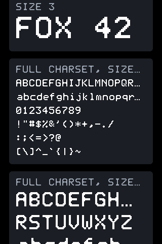
Look at the two panel headings: FULL CHARSET, SIZE…. At 13px per
character the label does not fit, so fitText cut it and marked the cut
with the single ellipsis glyph — one character, not three dots. The
character rows below were authored short enough to fit and are untouched.
Quick reference
Section titled “Quick reference”| call | returns |
|---|---|
fadv(size) | advance in px of one character at size |
flh(size) | glyph height at size; line pitch is this + 2 |
fink(size) | visible cap-ink height, what input centres on |
em(n) | n line-heights of FONT.lineH, snapped to FONT.quantum, never 0 |
fitText(str, size, availW) | str cut to fit, ellipsis-marked |
textLines(str, size, availW) | array of word-wrapped lines, over-long words hard-broken |
FONT field | meaning |
|---|---|
advance | px per character at size 1 |
lineH | px per line at size 1; the unit em() multiplies |
quantum | alignment unit em() snaps to, default 1 |
pick | pickFont, or null to scale one face linearly |
Run the worked example with examples/fonts/app.jsx on any runner; press
the sim’s FONT button or pass --font=4x6|6x8|12x16 to pin a face and
watch 1EM in the header change with it.
See also layout.md for how em() spacing and text heights
feed the layout walk, ui.md for the text element’s place in
the element list, input.md for the field that centres on
fink(), and contract.md for what a backend owes
gfx.text.