Designing for round glass
everything else in mjsx ignores that; a handful of things must not. This page is the list of things that must not, each with the picture of what goes wrong or right.
The rule underneath all of it: an app does not branch on the board. It
asks the shape one question, UI.isRound(), and the layout primitives
handle the rest. The page below is the same source on both shapes.
- One page, two shapes
- Asking the shape:
UI.isRound() - The safe rect: holding the flow inside the circle
- The chord: how wide the glass is at a given height
- Chord-fitted rows vs one uniform width
- ArcFooter: controls along the rim
- The end margin: a quarter screen of overscroll
- The edge-back swipe
- Where controls go
- What to check on a round build
One page, two shapes
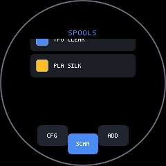
Section titled “One page, two shapes”One list, one footer, one source file. The shot script runs it unchanged on the 3.5” rectangle and on the round 1.28”.
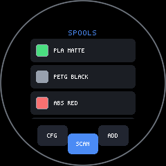
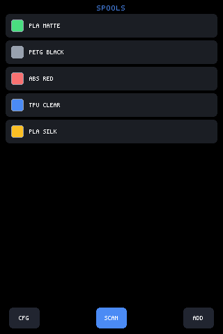
The whole of the shape-awareness is the first three lines
(scripts/shoot.mjs, SHAPE_PAGE — the page these two shots run):
UI.safe = UI.isRound() ? { top: 36, left: 36, right: 36, bottom: 60, inset: true } : { top: 0, left: 0, right: 0, bottom: 44, inset: true };UI.mount(function () { var rows = []; var names = ['PLA MATTE', 'PETG BLACK', 'ABS RED', 'TPU CLEAR', 'PLA SILK']; for (var i = 0; i < names.length; i++) { rows.push(h('row', { bg: UI.theme.panel, radius: 6, pad: 8, gap: 8, h: 34 }, [ h(Swatch, { color: [0x4ade80, 0x98a1ae, 0xf87171, 0x4b8bf5, 0xfbbf24][i], size: 18, w: 18 }), h('text', { text: names[i], size: 1, middle: true }) ])); } return h('box', { h: gfx.height(), pad: em(1), gap: em(0.5) }, [ h('text', { text: 'SPOOLS', size: 2, align: 'center', color: UI.theme.accent }), h('box', { flex: 1, scroll: 'spools', gap: 4 }, rows), h(ArcFooter, { items: [ /* three 44x30 buttons */ ], at: 90, spread: 60 }) ]);});Nothing below that ternary asks what the glass is.
Asking the shape: UI.isRound()
Section titled “Asking the shape: UI.isRound()”The app does not measure the panel and guess. The host declares it, and
the answer never changes while the process runs, so the core reads it once
and caches (packages/core/src/mjsx.js):
isRound: function () { if (this._round === undefined) { this._round = configStorage.get('round', '0') === '1'; } return this._round;},The channel is configStorage’s 'round' key, and the firmware seeds it
at boot before any script can read it — the round build compiles with
ROUND_DISPLAY, so the board knows what it is and the bundle never has to
(filament-rfid-bridge.ino):
#if defined(ROUND_DISPLAY) && ROUND_DISPLAY { // The bundle asks configStorage whether the glass is round; the // host answers once, through the same store (UI.isRound()). Preferences pf; pf.begin("jsapp", false); if (pf.getString("round", "") != "1") pf.putString("round", "1"); pf.end(); }#endifA host that says nothing leaves the key unset, so isRound() is false and
the default '0' does the right thing — which is what the terminal and the
SDL sim do today (see D4 in consistency.md: the sim
draws a circular mask without telling the core, so it previews the shape
without the behaviour).
Everything that does claim to show round glass seeds the key exactly as the
firmware does. The headless shot renderer sets
backend.sys.store('round', '1') on a round profile, the golden matrix
does the same before requiring an example, and the browser
simulator sets it from the panel you choose. That is why
the round pictures on this page come out of the same code path a board
runs, and why picking round glass in the simulator changes behaviour and
not just the outline.
The safe rect: holding the flow inside the circle
Section titled “The safe rect: holding the flow inside the circle”UI.safe = { top, left, bottom, right, inset } marks edge bands. With
inset: true the layout is held inside the safe rect while the
background still paints full-bleed, and touches in the band snap to the
content edge. That is the one mechanism that keeps ordinary rectangular
rows on round glass — see ui.md for the general contract.
The numbers are geometry, not taste. On the 240px circle, a 36px inset on
three sides leaves a 168px-wide band; its top corners sit
sqrt(84² + 84²) = 118.8px from centre, inside the 120px radius, so the
whole rectangle is on the glass. The bottom band is 60px instead of 36
because the footer lives there.
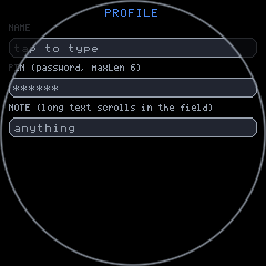
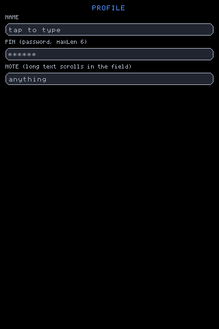
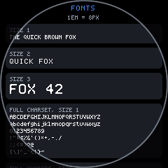
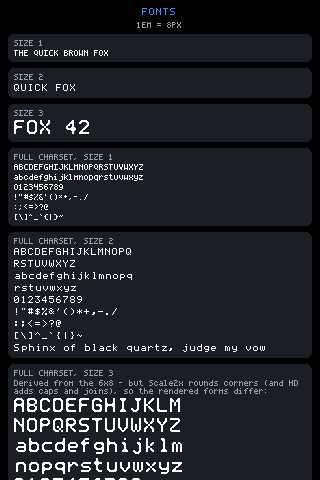
Text metrics need no round-specific handling at all — em() follows the
picked font face, so a page written once relays out for the smaller panel
with no size in the source changing:
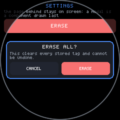
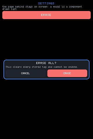
Modals get it for free, because their margins are minimums rather than fixed offsets:
The chord: how wide the glass is at a given height
Section titled “The chord: how wide the glass is at a given height”A circle’s width depends on where you measure. gfx.width() is 240 on the
round board, and that number is only true across the exact middle. Any row
that is not in the middle has less. The core computes the real number —
half the chord across a horizontal band, taking whichever of the two edges
is farther from centre, minus a hair for the bezel:
function kbChordHW(yTop, yBot) { var c = gfx.height() / 2, r = c - 2; var a = yTop < c ? c - yTop : yTop - c; var b = yBot < c ? c - yBot : yBot - c; if (b > a) a = b; if (a >= r) return 0; return Math.floor(Math.sqrt(r * r - a * a)) - 3;}Two places in the core use it, and both are worth copying.
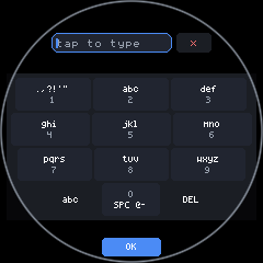
One: deciding what fits. The keyboard’s auto layout picks by width,
and the width it asks about is the chord down where the bottom rows sit,
not the bounding box:
if (UI.isRound()) kbW = kbChordHW(gfx.height() * 0.72, gfx.height() * 0.86) * 2;On the 240px circle that band is 154px across, not 240. QWERTY wants ~220, T9 wants ~115, so the honest measurement picks T9 and the naive one would have picked a QWERTY whose outer columns were under the bezel.
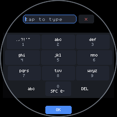
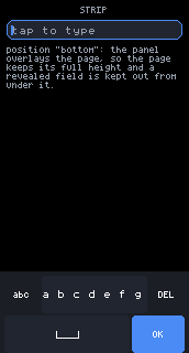
Two: shaping each row. kbRoundRow insets a row to the chord at its
own height, so a round keyboard is a trapezoid — the bottom row is
narrowest because it is nearest the rim, which is exactly where an un-inset
layout puts the space bar and OK.
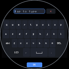
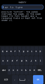
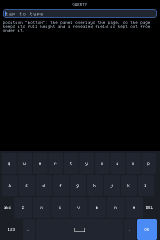
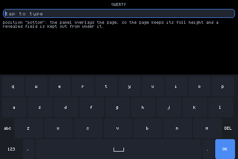
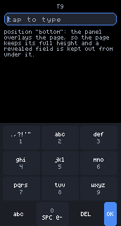
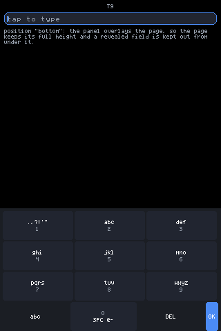
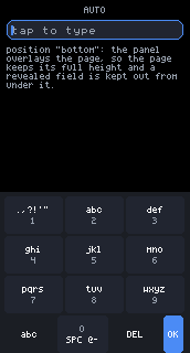
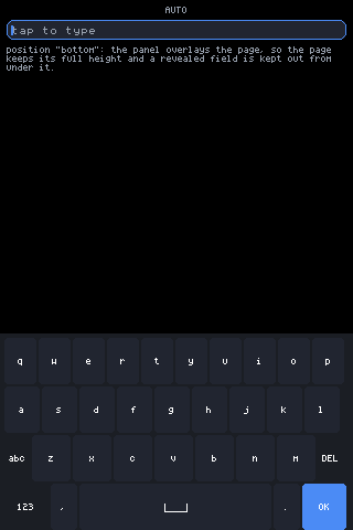
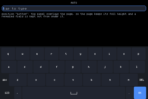
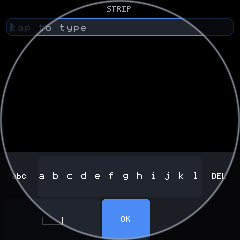
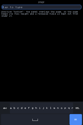
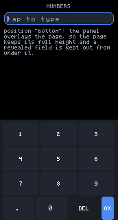
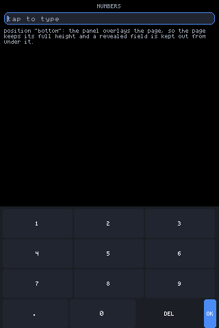
The exception proves the mechanism. A keyboard that stays docked is not chord-inset, because a docked panel is a screen-edge overlay:
Chord-fitted rows vs one uniform width
Section titled “Chord-fitted rows vs one uniform width”The keyboard fits every row to its own chord. Lists should not. The keyboard is a grid of keys where each row is visibly its own object and a stepped edge reads as shape; a list of rows is meant to read as one column, and per-row widths make that column look like it is wobbling as it scrolls.
So content pages take a single uniform inset that the whole circle
contains — the safe rect above — and let the corners go unused. The
sensors example states it in one line
(examples/sensors/app.jsx):
/* Round glass gets a uniform inset that keeps every panel inside the circle. The SHORT labels are a question of width, not shape: the 1.47" is a perfectly square 172px panel and truncates "acceleration" just as readily as the circle does. */var round = UI.isRound();var narrow = round || gfx.width() < 200;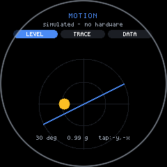
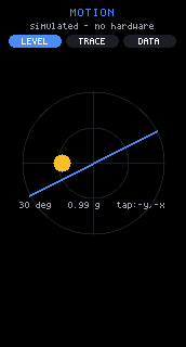
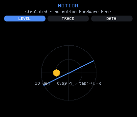
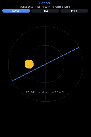
The second half of that comment is the other half of the lesson. Narrow
is not the same question as round. Label truncation is a width problem,
and the 172px 1.47” rectangle hits it just as hard as the circle, so the
example gates short labels on round || gfx.width() < 200 rather than on
shape alone:
ArcFooter: controls along the rim
Section titled “ArcFooter: controls along the rim”ArcFooter places finished items where the ray from screen-centre at each
item’s angle meets the boundary, pulled inward by the item’s own size. On
round glass the boundary is the rim; on square glass it is the rectangle’s
perimeter. One call serves both:
var round = UI.isRound();var inset = p.inset === undefined ? (round ? 10 : 8) : p.inset;var spread = (p.spread || 120) * Math.PI / 180;var a0 = (p.at === undefined ? 90 : p.at) * Math.PI / 180 - spread / 2;/* ...then, per item, at angle `ang` along the sweep: */var c = Math.cos(ang), s = Math.sin(ang);var d;if (round) { var big = items[i].w > items[i].h ? items[i].w : items[i].h; d = H / 2 - inset - big / 2;} else { var hx = W / 2 - inset - items[i].w / 2; var hy = H / 2 - inset - items[i].h / 2; var tx = c < 0 ? -hx / c : (c > 0 ? hx / c : 1e9); var ty = s < 0 ? -hy / s : (s > 0 ? hy / s : 1e9); d = tx < ty ? tx : ty;}Props: items ([{ w, h, node }] — finished elements, w/h centre each
on its boundary point without measuring), at (centre angle, 90 = bottom
and the default, 270 = top), spread (total sweep, default 120), inset
(margin from the boundary, default 10 round / 8 square). Full prop notes
live in components.md.
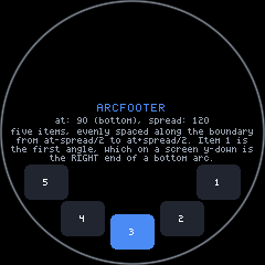
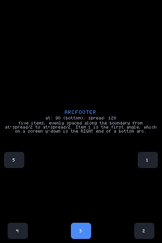
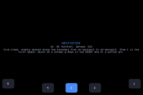
Two rules the pictures make concrete:
- Items stay upright. Text is never rotated. Only positions follow the edge. Rotated glyphs are neither drawable by the text primitive nor readable at these sizes.
- Put wide items mid-list. The boundary is most generous near the
centre angle; angles that cluster at a square’s corner can overlap, so
keep
spreadand item count sane, and check the square shot as well as the round one.
An arc footer is also how a round app buys back the screen a toolbar would
have cost. examples/draw/app.jsx moves its whole toolbar to the rim when
the glass is round:
if (UI.isRound()) { var items = []; items.push({ w: 38, h: 22, node: <Button label={tool.toUpperCase()} size={1} pad={em(0.25)} h={22} w={38} bg={0x2e4a37} color={0x9fe8b9} onTap={function () { /* cycle the tool */ }} /> }); // ... the colour swatches climb the rim from there}The end margin: a quarter screen of overscroll
Section titled “The end margin: a quarter screen of overscroll”The bottom arc is the narrowest part of the display, and it is where the last row of any list ends up. So every scroll zone on round glass gets a quarter-screen of extra range, unconditionally:
/* Round glass: a quarter-screen of extra range, UNCONDITIONALLY, so the last rows can be lifted out of the narrow bottom arc into the wide middle. Content that FITS the square still drowns in the circle — a zone whose maxOff computed to zero is exactly the one whose bottom row is stuck in the arc. */if (UI.isRound()) maxOff += gfx.height() >> 2;On the 240px panel that is 60px of overscroll. The “unconditionally” is
load-bearing: the zone that most needs the margin is the short one whose
content already fits, because its maxOff is zero and without this line it
cannot be scrolled at all — leaving its last row parked in the arc
permanently.
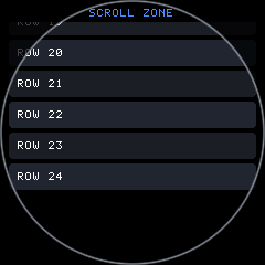
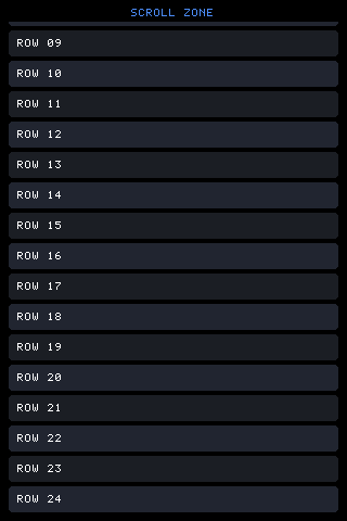
The end margin in a real page: the bottom of the list is readable in the middle of the circle rather than crushed against the rim.
UI._scrollTo clamps to the same maxOff, so programmatic scrolls,
flings, and scrollBy all inherit the margin — round overscroll is baked
into the zone’s limit rather than applied at each call site.
The edge-back swipe
Section titled “The edge-back swipe”Round glass has no corner to put a close button in. Rather than spend rim space on one, the core makes an inward swipe from either rim send Escape — the same key the BOOT button sends, so an app that already handles hardware back needs no round-specific code.
Arming, at press time:
/* EDGE-BACK: a press at the left or right rim arms the gesture; travelling inward turns the stroke into Escape. +1 = inward is rightward, -1 leftward, 0 = not an edge press. */eb: x < 12 ? 1 : (x > gfx.width() - 12 ? -1 : 0)Firing, on move:
if (p.eb && !p.fired) { var inw = dx * p.eb; if (inw > 40 && (dy < 0 ? -dy : dy) < 60) { p.fired = 1; p.key = null; this.key('press', 'Escape'); return; }}The thresholds: the press must start within 12px of a side, travel more than 40px inward, and stay within 60px vertically. It is not round-only — every screen gets it — and drawing surfaces never see it, because a canvas that has taken the stroke owns it before this code is reached.
Where controls go
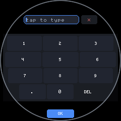
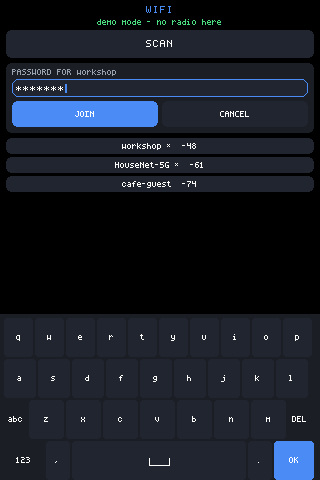
Section titled “Where controls go”OK goes in the bottom arc. Below the last key row of a full-display
keyboard there is a sliver of glass too narrow for a full-width row and
perfectly sized for one button. Every layout but strip parks OK there,
and caps its width to the chord it actually has:
var okInArc = UI.isRound() && layout !== 'strip' && !!UI._exclusive;...var okW2 = Math.min(kbChordHW(okTop, okTop + okH2) * 2, em(10));Because the arc was unusable space, moving OK there costs the key grid no height at all.
Note the UI._exclusive term: only the full-display view draws that
arc, so only it may take OK out of the rows. The flag does both jobs, and
deciding it from the shape alone — before the auto-exclusive rule has even
run — left a docked round T9 with no OK key anywhere: dropped from the
row, and no arc to put it in.
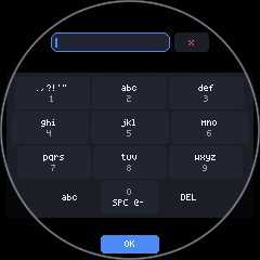
The mirrored input in exclusive mode gets the same treatment from the other
end — it is pushed a tenth of the display down, off the narrow top arc,
where at y = 0 the chord is nearly nothing.
Everything else goes on an arc. at: 90 is the bottom arc (the
default), at: 270 the top. Buttons need no round variant to sit there:
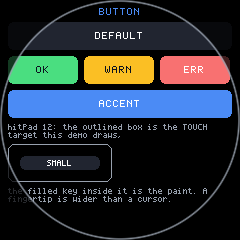
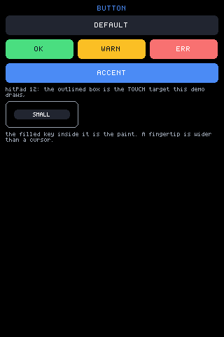
Exit is the edge-back swipe, not a control. That is the trade the section above buys: no rim space spent on a close affordance, and the gesture works identically on the boards that do have corners.
What to check on a round build
Section titled “What to check on a round build”| Check | Where it bites | Section |
|---|---|---|
Does the page set UI.safe with inset: true? | Rows run under the rim | safe rect |
Did you measure width with gfx.width()? | It is only true across the middle | chord |
| Do list rows share one width? | Per-row insets read as wobble | uniform width |
| Can the last row be scrolled clear of the arc? | Short lists, maxOff of zero | end margin |
| Is there a way out without a corner button? | Exit affordance | edge-back |
| Does the same source still look right square? | Round-only branches drift | one page, two shapes |
That last row is the one that catches most regressions. Every round shot on this page has a square counterpart generated from identical source, and that is the point: round is a shape the layout absorbs, not a fork of the app.
Related: ui.md for UI.safe and scroll zones,
components.md for ArcFooter and Keyboard props,
devices.md for the round board’s flashing quirks.