Skip to content

One screen, every shape

A mockup. The same app, rendered on each shape in the fleet — click a

thumbnail to enlarge it.

The point of the pattern is that a reader compares shapes in place instead of scrolling past four stacked figures, and that the picture they enlarge is the same picture they picked. It is CSS only, so it costs no script and degrades on a plain git host to the four figures shown one after another.

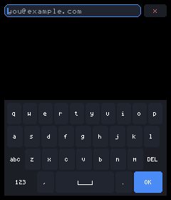
Below is examples/input/app.jsx with a field focused, so the keyboard is up. Nothing in that file mentions a display shape: the layout, the keyboard layout, and whether the keyboard docks or takes the screen are all decided from the room available.
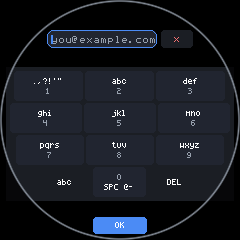
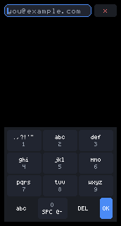
The input example on a 240 by 240 round display
Round, 240×240 (1.28″). Auto picks T9: the circle measures 240 across the middle but only about 154 where the bottom rows sit, and ten columns will not fit there. Each row is inset to the chord at its own height, so the keyboard is a trapezoid and no key hides under the bezel. OK sits in the bottom arc, which the key grid could never use.
The input example on a 240 by 280 portrait display
Portrait, 240×280 (1.69″). The shape the examples were drawn for. The keyboard docks at the bottom and the form scrolls above it, with an inset so a focused field is never left underneath.
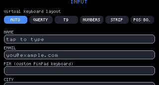
The input example on a 172 by 320 narrow portrait display
Narrow portrait, 172×320 (1.47″). 172px is under the 220px that ten columns need, so auto picks T9 here too — on a square panel, for the same reason as the circle: the width the keys actually get.
The input example on a 320 by 172 landscape display
Landscape, 320×172 (1.47″ sideways). Wide enough for QWERTY, but only 172px tall — docked keys would come out under a finger's height, so the keyboard takes the whole display and mirrors the field above itself. The mirror is the field: input state is keyed by id, so it carries the same text and caret.
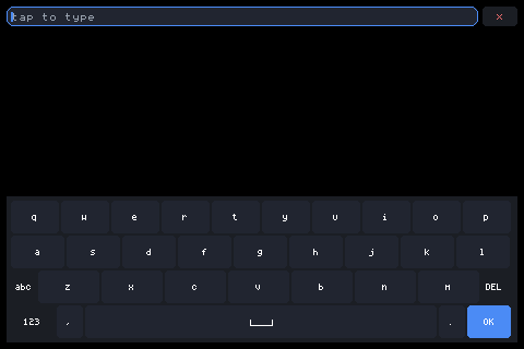
The input example on a 480 by 320 landscape display
Large landscape, 480×320 (3.5″ sideways). The biggest glass in the fleet and the only one wide and tall enough to DOCK a full QWERTY rather than go fullscreen: ten columns fit across, and 320px leaves the form readable above them.

Against: every page that uses it needs a shot per shape, which is four renders instead of one, and the switcher is only meaningful where the shapes genuinely differ. A Button looks like a button everywhere.

For: it is exactly right for the pages about adapting to a display — keyboards, layout, round glass, and the boards themselves — where the whole subject is that the same code produces different pictures.

The shots are cheap to make (bun scripts/shoot.mjs <name> <profile> <app.jsx>) and the markup is a plain block of HTML, so adopting it page by page costs nothing up front and can stop wherever it stops earning its place.